


Designing a Contemporary Identity for Ancient Grain Flours
A contemporary brand identity and packaging system for an artisanal grain and flour brand — reimagining everyday staples through modern design, thoughtful storytelling, and process-led visual language.
THE CHALLENGE
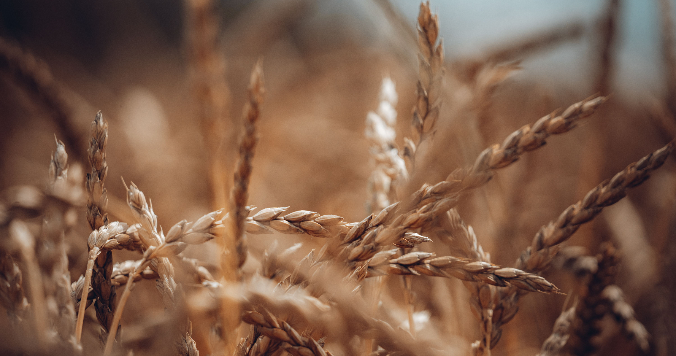
How do you make everyday grains feel contemporary, premium, and approachable—without losing their connection to the land?
The Concept
A Walk Through the Fields
A minimal identity inspired by the simple act of walking through cultivated fields—translating movement, landscape, and harvest into a contemporary visual symbol.
A minimal identity inspired by the simple act of walking through cultivated fields—translating movement, landscape, and harvest into a contemporary visual symbol.
Logo & Form
Fields in Motion
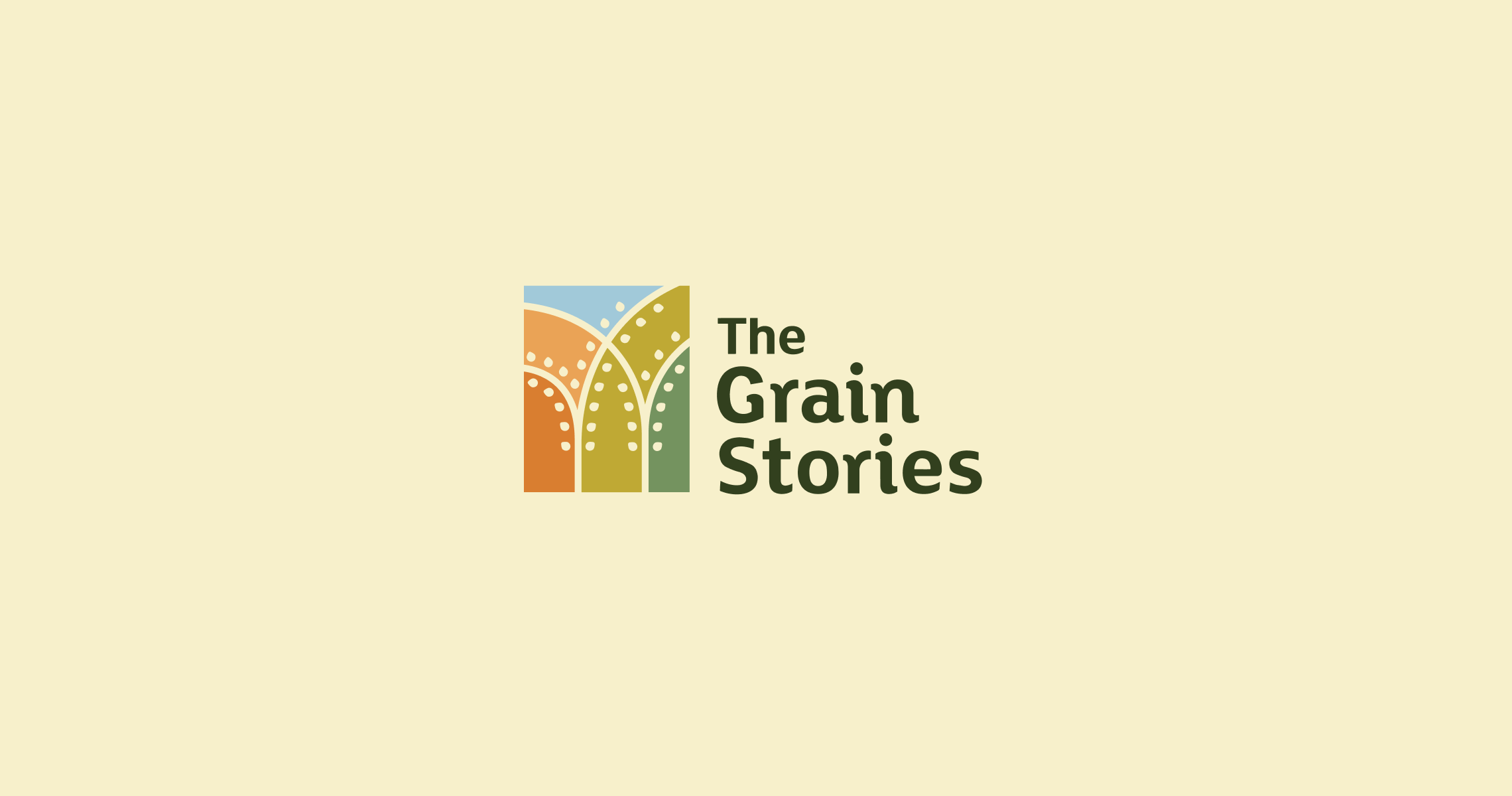
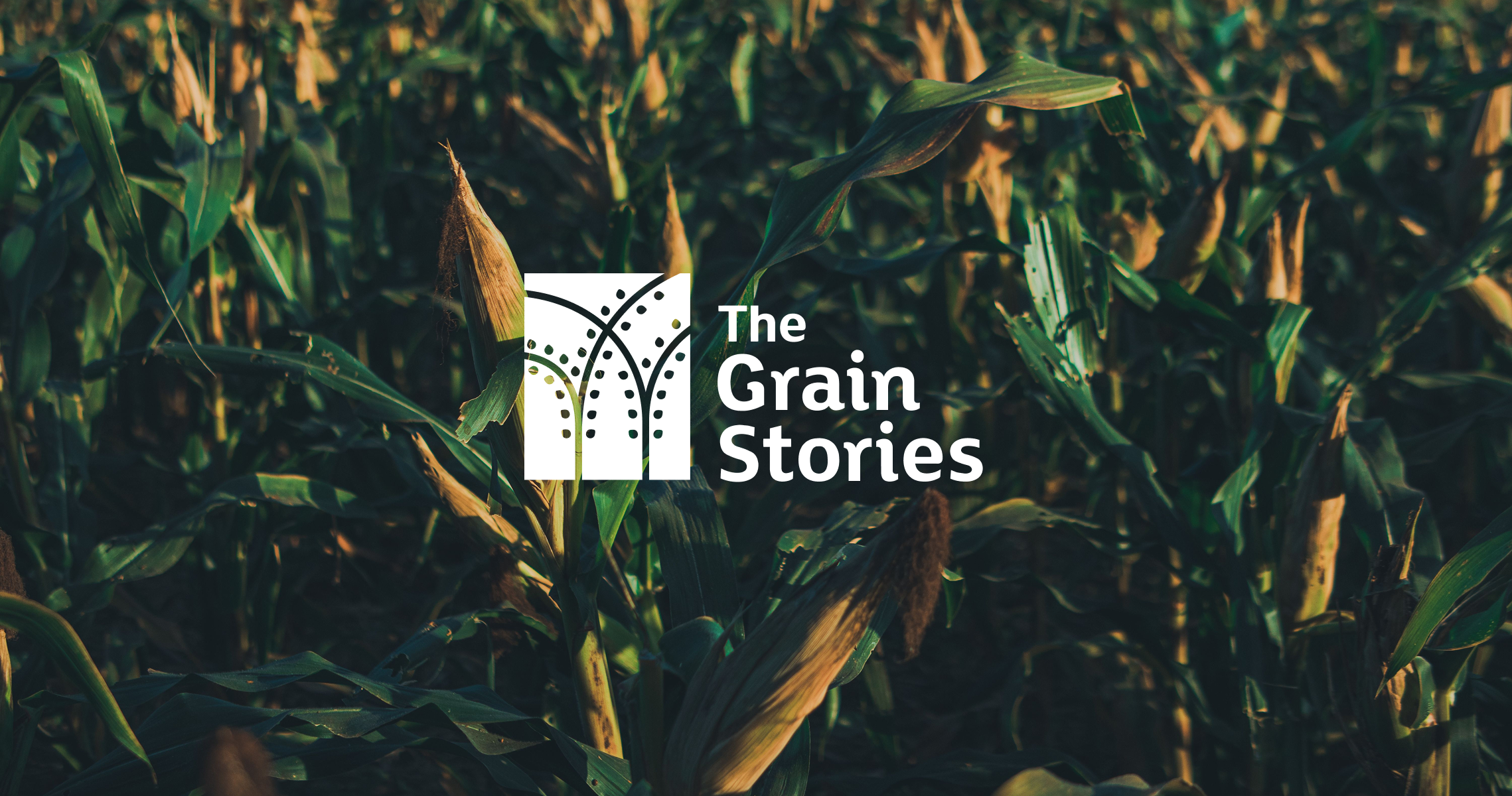
Rather than illustrating grains literally, the identity abstracts the experience of entering a field. Vertical grain stalks intersect a geometric frame, creating a symbol that feels both rooted in agriculture and refined through modern design. The result is an identity that celebrates where food begins while reflecting the clean, sophisticated processes behind the brand.
Rather than illustrating grains literally, the identity abstracts the experience of entering a field. Vertical grain stalks intersect a geometric frame, creating a symbol that feels both rooted in agriculture and refined through modern design. The result is an identity that celebrates where food begins while reflecting the clean, sophisticated processes behind the brand.
Colour System
Colour as Seasonal Logic
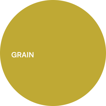
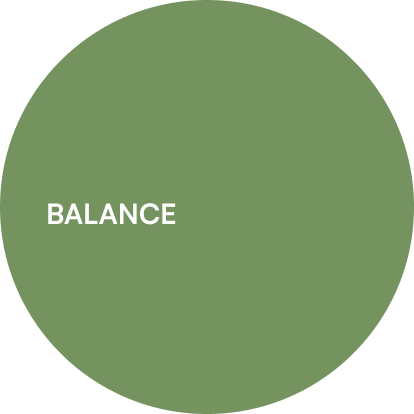
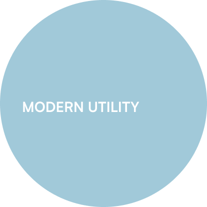
A palette inspired by the changing landscape of grain-growing regions—capturing harvest, earth, vegetation, and open skies.
Each colour reflects a different stage of the agricultural journey while allowing future product categories to develop their own recognisable identity.
A palette inspired by the changing landscape of grain-growing regions—capturing harvest, earth, vegetation, and open skies.
Each colour reflects a different stage of the agricultural journey while allowing future product categories to develop their own recognisable identity.
VISUAL LANGUAGE
A Living Visual Language
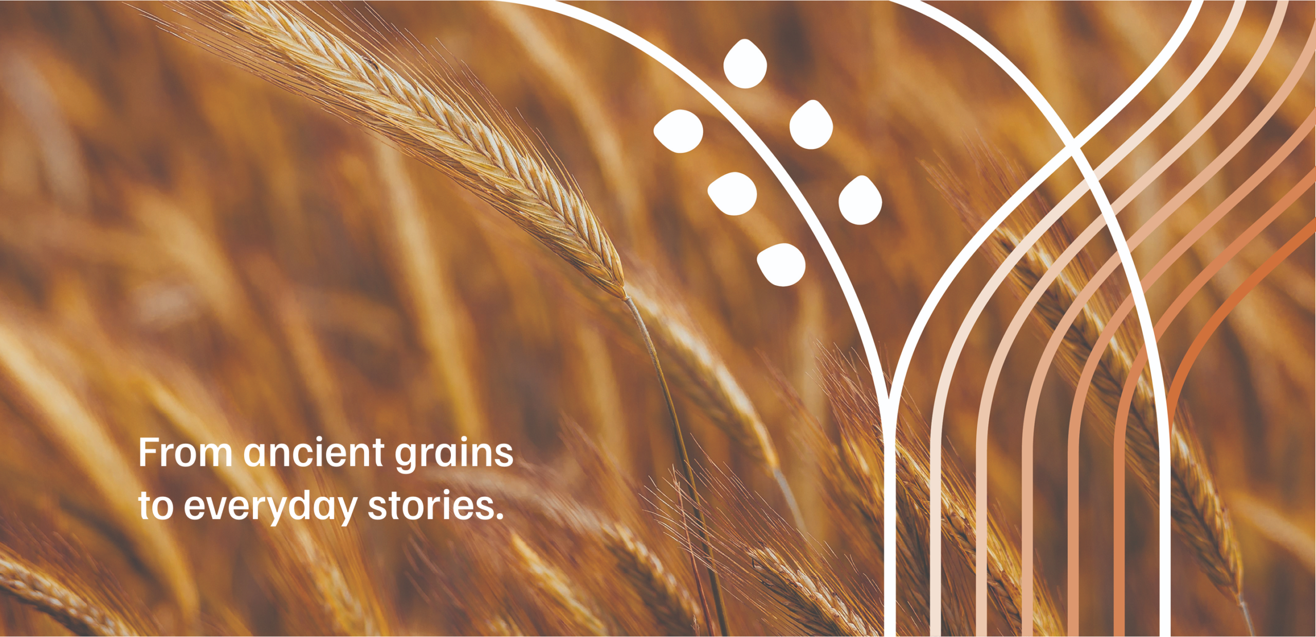
The minimal grain stalks evolve into a flexible graphic system that extends seamlessly across every brand touchpoint. The repeating forms become framing devices, graphic dividers, and compositional elements—creating consistency without becoming repetitive. Their simplicity allows photography, messaging, and packaging to remain the hero while subtly reinforcing the identity.
The minimal grain stalks evolve into a flexible graphic system that extends seamlessly across every brand touchpoint. The repeating forms become framing devices, graphic dividers, and compositional elements—creating consistency without becoming repetitive. Their simplicity allows photography, messaging, and packaging to remain the hero while subtly reinforcing the identity.
Packaging Design
Illustrating the Grain Journey
A contemporary illustration system that celebrates both the landscape and the carefully crafted process behind every product.
A contemporary illustration system that celebrates both the landscape and the carefully crafted process behind every product.
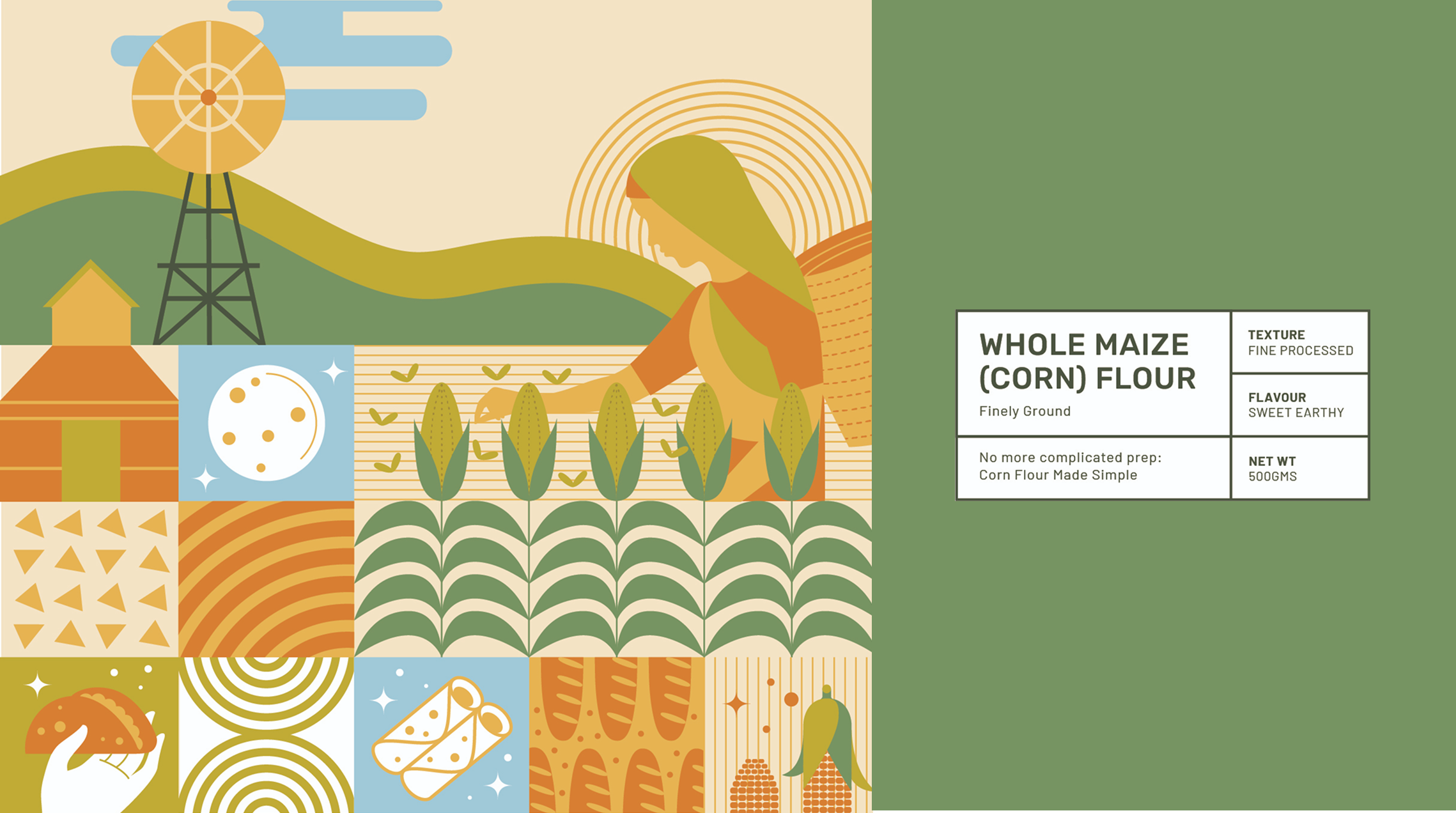
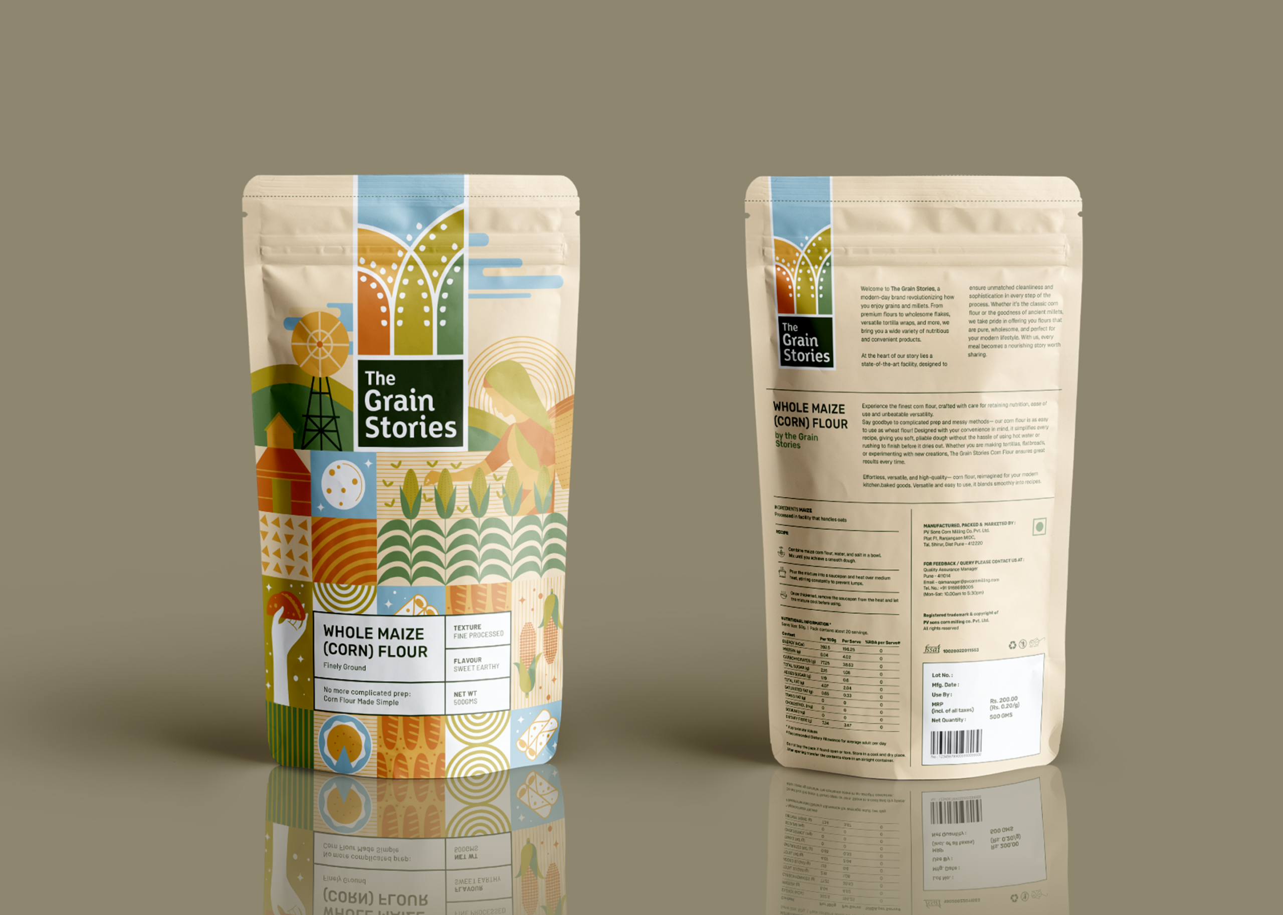
The packaging uses a modern grid-based composition where each illustrated panel captures a different part of the grain story—from cultivated fields and farming communities to processing, milling, cooking, and everyday use. Inspired by modernist poster design, the illustrations balance bold geometric forms with organic shapes, creating a system that feels playful, informative, and premium.
CREATIVE DIRECTION Trusha S
DESIGN PRADYUTH
RITHWIK IYAPPA
Trusha S
RITHWIK IYAPPA
Trusha S
BRAND STRATEGY WASEEM CHISHTY
CLIENT TANGRAM COMMUNICATIONS
& GRAIN STORIES
& GRAIN STORIES