

From Emotion to Form: Building a Visual Language through Colour
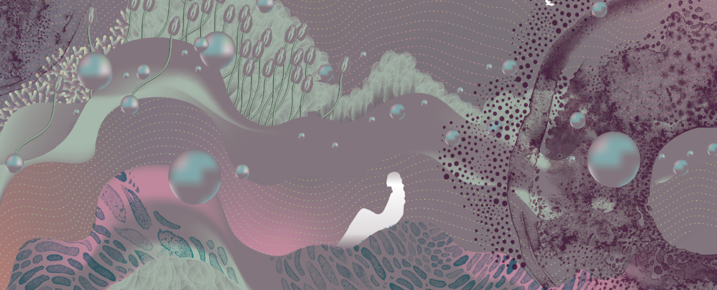
A visual system derived from Cardinal — a colour that embodies emotional depth, introspection, and expansive human experience, translated into immersive, sensorial landscapes.
COLOUR STUDY
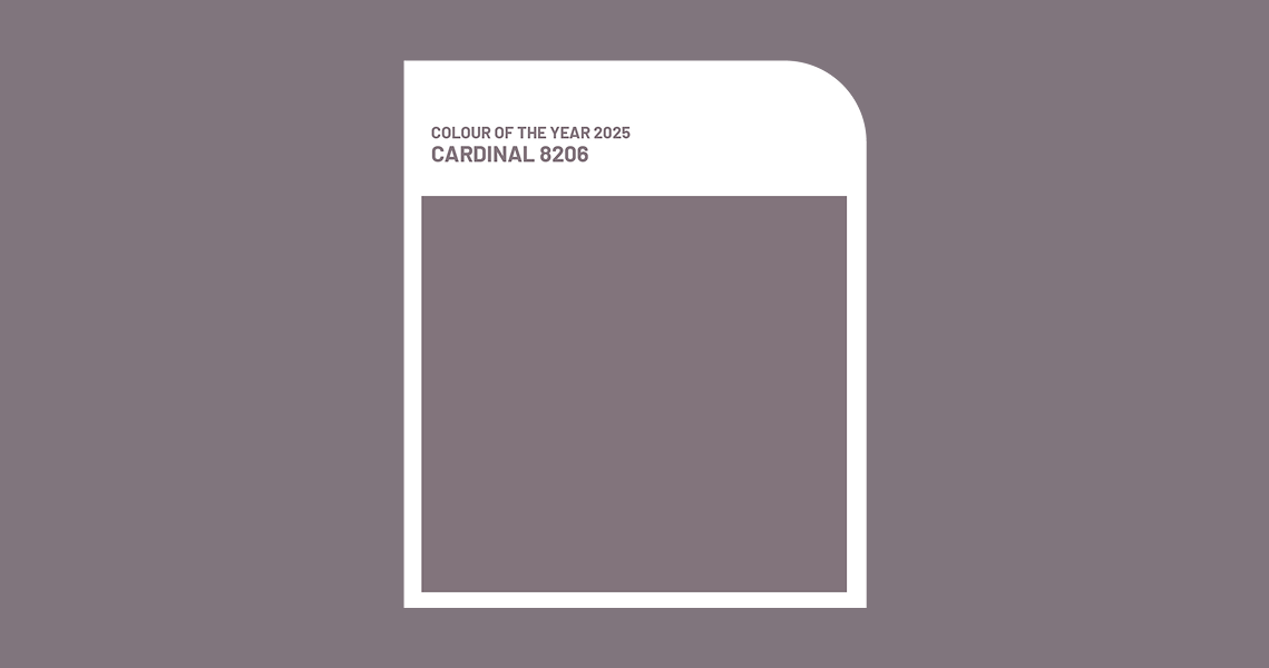
Cardinal — An Emotional Spectrum
A visual exploration of Cardinal — translating a deeply introspective hue into a layered, sensorial visual language.
A visual exploration of Cardinal — translating a deeply introspective hue into a layered, sensorial visual language.
Essence of the Colour
Feeling Everything, Fully
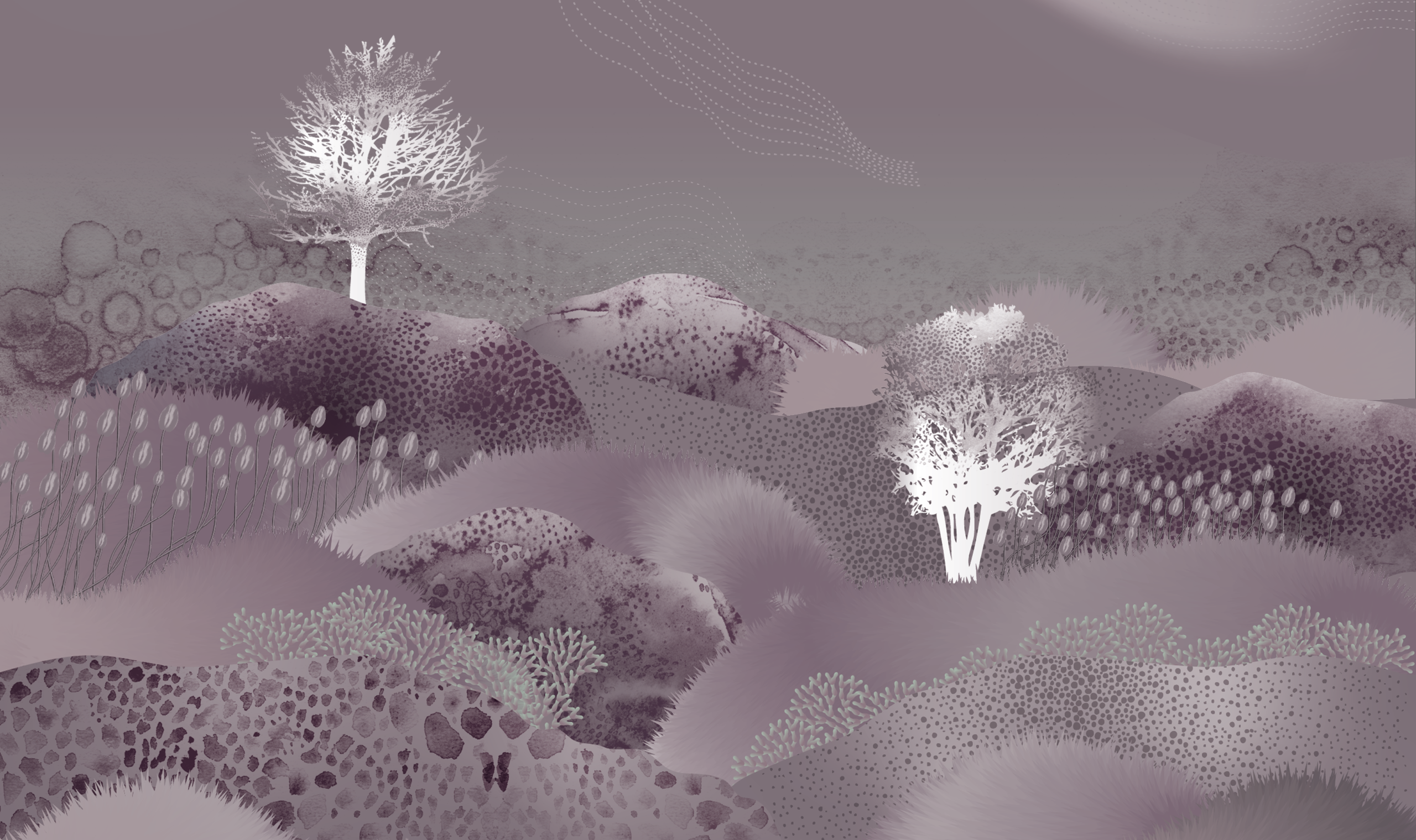
Cardinal is a colour rooted in emotional depth — an invitation to embrace the full spectrum of human experience. It holds space for everything: stillness and turbulence, clarity and ambiguity, joy and melancholy. Often described as a contemplative and immersive hue, Cardinal reflects a growing cultural shift towards authenticity and emotional awareness — encouraging us to sit with our feelings rather than resolve them. It is both inward and expansive — grounding yet expansive — creating a quiet yet powerful emotional presence.
Cardinal is a colour rooted in emotional depth — an invitation to embrace the full spectrum of human experience. It holds space for everything: stillness and turbulence, clarity and ambiguity, joy and melancholy. Often described as a contemplative and immersive hue, Cardinal reflects a growing cultural shift towards authenticity and emotional awareness — encouraging us to sit with our feelings rather than resolve them. It is both inward and expansive — grounding yet expansive — creating a quiet yet powerful emotional presence.
Keywords
EMOTIONAL SPECTRUM
- Pensive
- Contemplative
- Reflective
- Melancholic
- Expansive
- Inward
- Outward
- Unapologetic
- Meditative
PHSYICAL SPECTRUM
- Layered
- Tactile
- Sensorial
- Grounded
- Portal-like
- Mature
- Quiet
- Focused
- Mystical


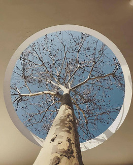

Visual Language
A Language of Depth and Layers
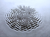
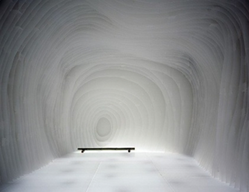
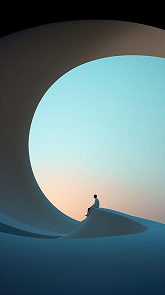
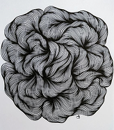
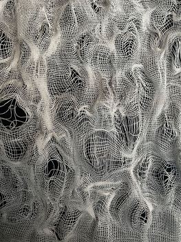
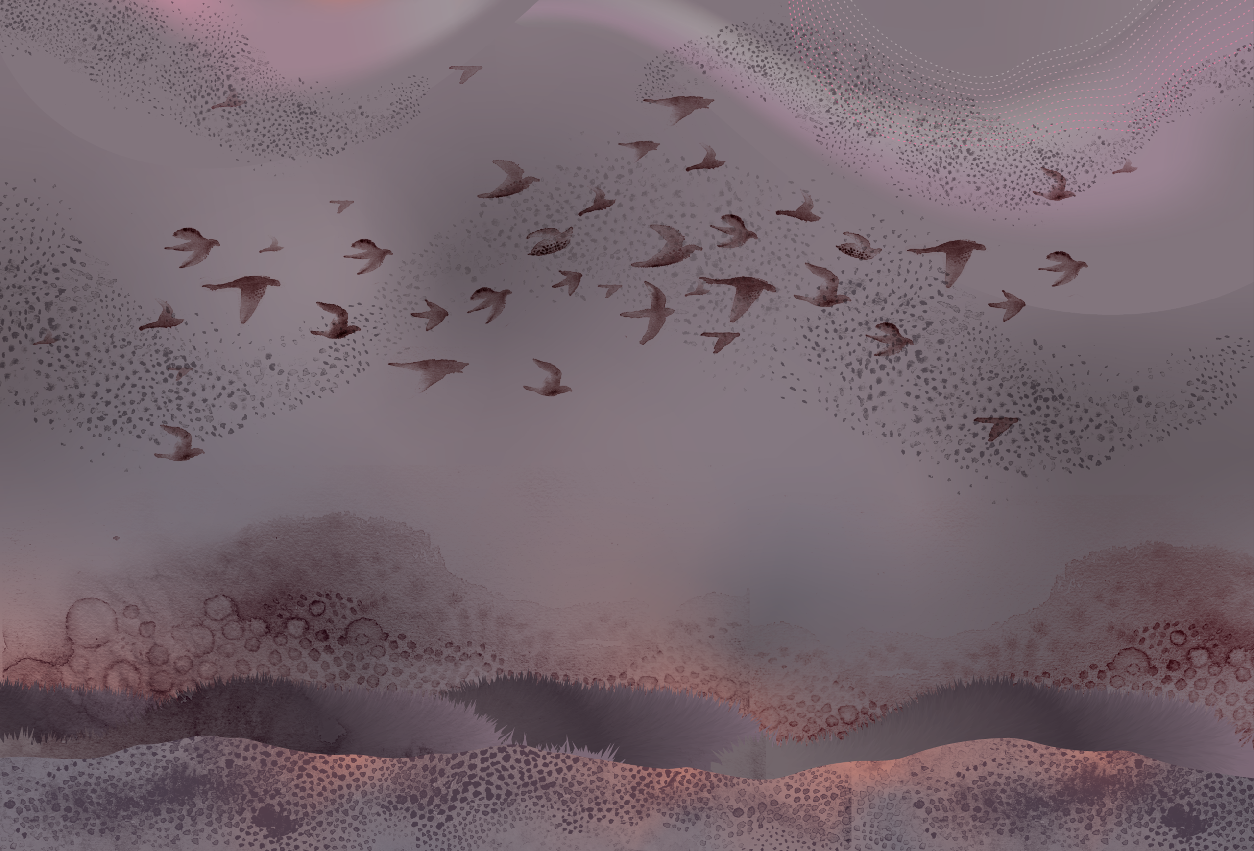
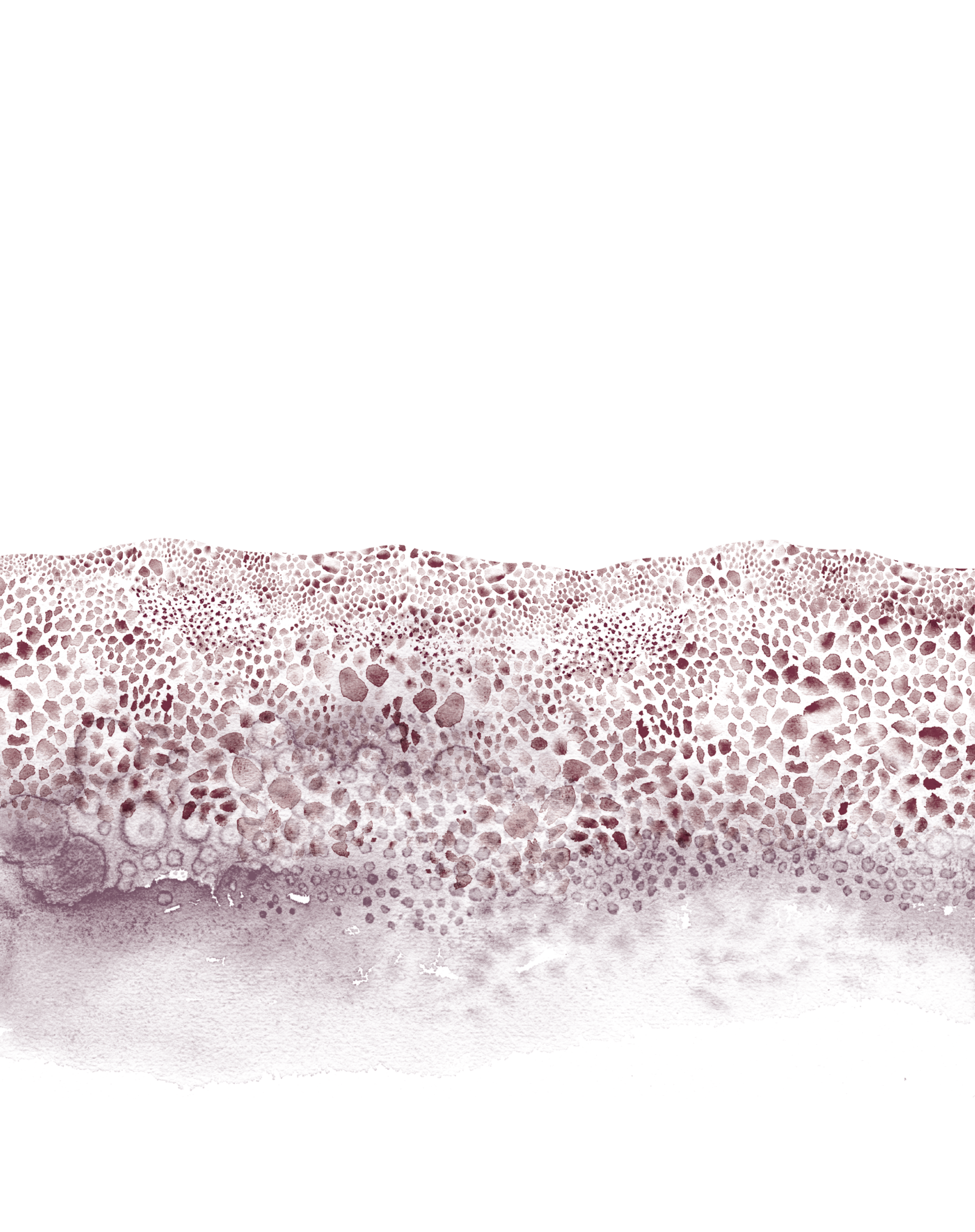
The visual system builds through layering — where forms dissolve, merge, and re-emerge.
There is no rigid structure; instead, compositions feel:
fluid, immersive, unfolding. The language avoids sharp clarity, choosing instead to hold ambiguity and softness, allowing the viewer to interpret and internalise the imagery.`
The visual system builds through layering — where forms dissolve, merge, and re-emerge.
There is no rigid structure; instead, compositions feel:
fluid, immersive, unfolding. The language avoids sharp clarity, choosing instead to hold ambiguity and softness, allowing the viewer to interpret and internalise the imagery.`




MATERIAL & MEDIUM
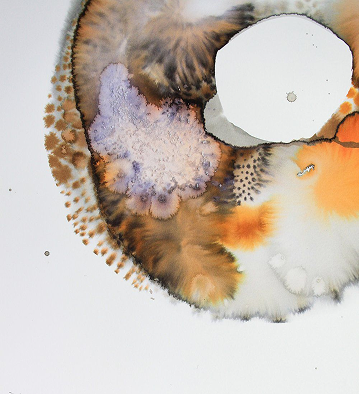
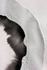
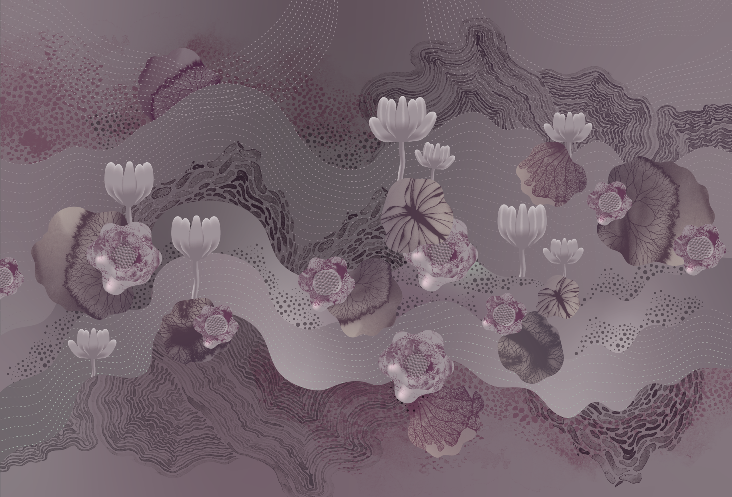
Watercolour becomes the primary medium — chosen for its ability to balance control and unpredictability.
Its fluid nature allows forms to bleed, merge, and evolve — mirroring the emotional states Cardinal represents.
Its fluid nature allows forms to bleed, merge, and evolve — mirroring the emotional states Cardinal represents.
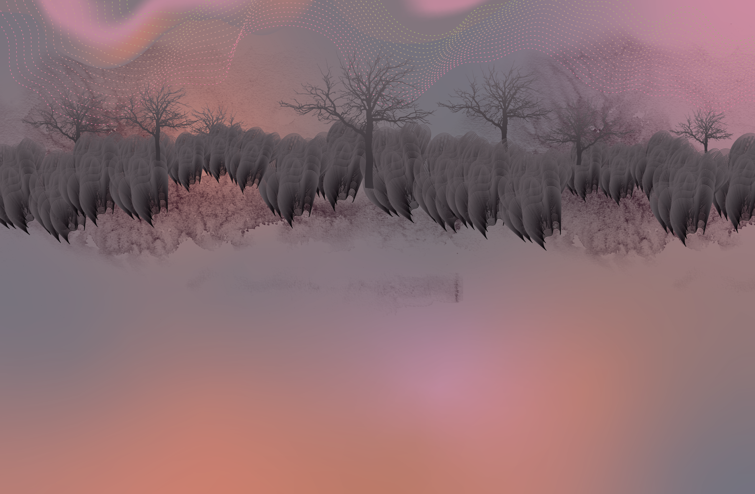

Layers build gradually, creating depth that feels both tactile and atmospheric. Whether viewed up close or from a distance, the medium retains a sensorial and immersive quality.


System Application
Extending the Language
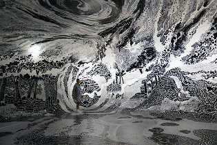
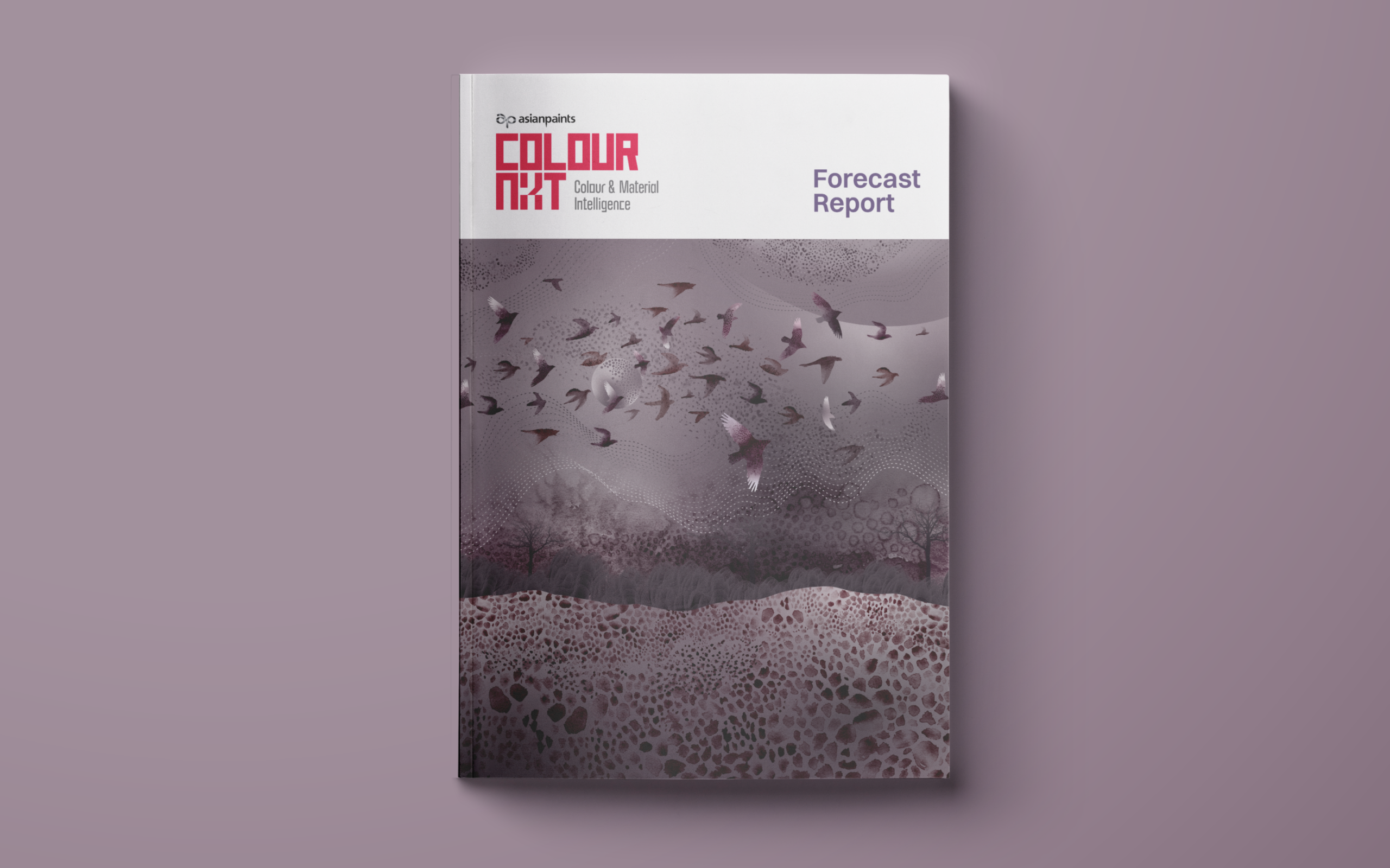
The visual language extends across formats — from print collaterals to exhibition graphics and spatial installations.
Rather than fixed outputs, the system behaves like a framework — adaptable yet consistent, allowing the colour narrative to evolve across contexts.
The visual language extends across formats — from print collaterals to exhibition graphics and spatial installations.
Rather than fixed outputs, the system behaves like a framework — adaptable yet consistent, allowing the colour narrative to evolve across contexts.


This exploration is less about defining a colour and more about experiencing it. Cardinal becomes a reminder that design can move beyond function — into a space where it allows us to pause, reflect, and feel.
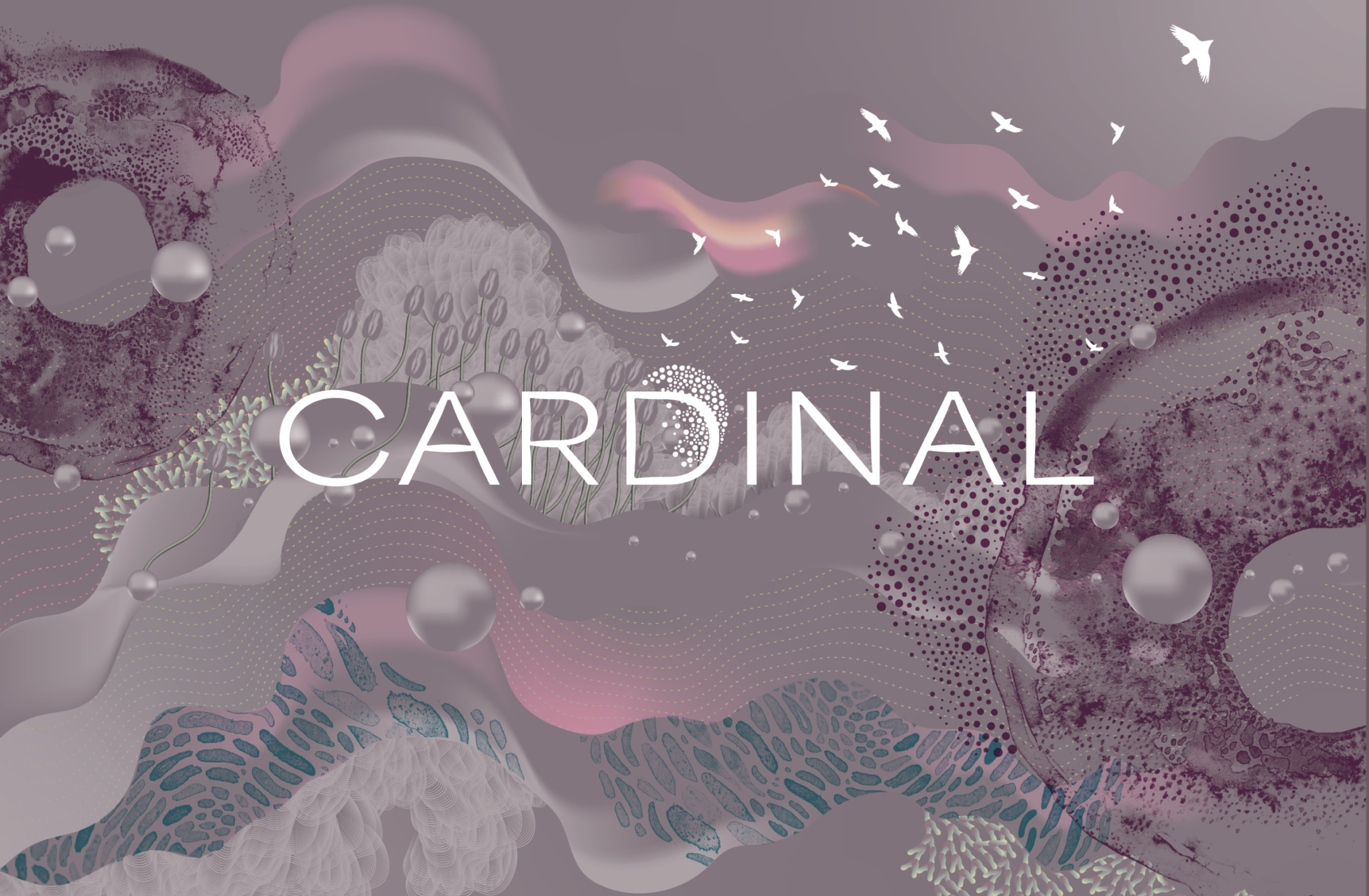
Illustration & Visual LanguageTrusha S
Collaboration STUDIO WARIWATAI
Client COLOURNEXT ASIANPAINTS