

Designing a Playful Identity for Native Plant Culture
Plant Nursery Brand Identity for Greens on Wheels explores how illustration, colour, and storytelling can celebrate indigenous plant culture. Inspired by the idea of a travelling plant cart, the identity creates a playful visual system that reflects curated plant combinations and a deep connection to native landscapes.
THE CHALLENGE
How do you create a brand identity that captures the evolving, curated nature of native plant combinations — while making it accessible, playful, and engaging for a wider audience?
The Concept
A Moving Garden
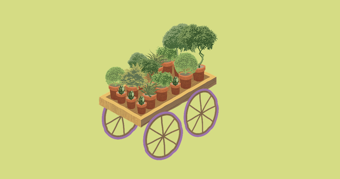
The identity draws from the idea of a travelling cart — a system that carries ever-changing plant combinations, much like curated recipes. The brand becomes a living, evolving entity rather than a fixed visual.
The identity draws from the idea of a travelling cart — a system that carries ever-changing plant combinations, much like curated recipes. The brand becomes a living, evolving entity rather than a fixed visual.

Logo & Form
A Mark in Motion
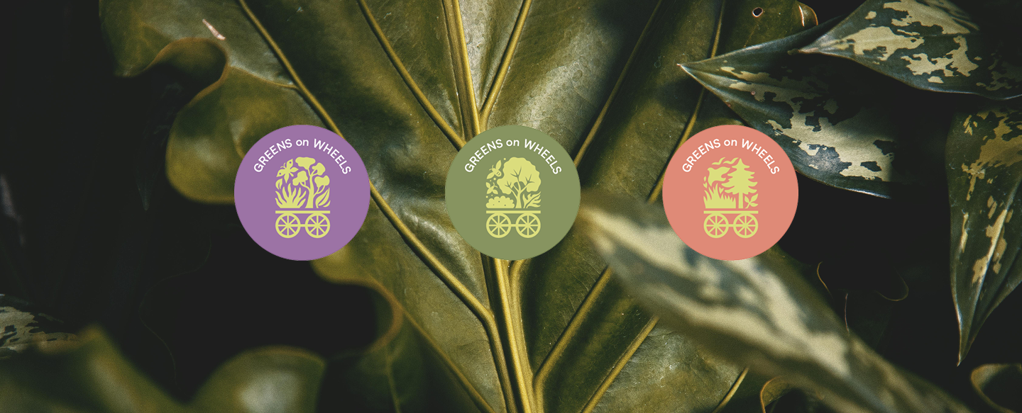
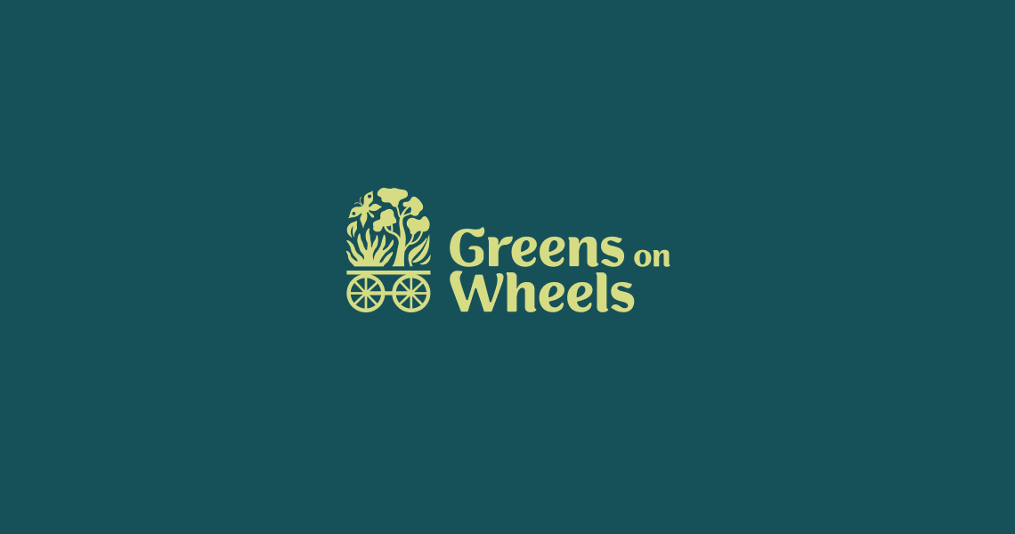
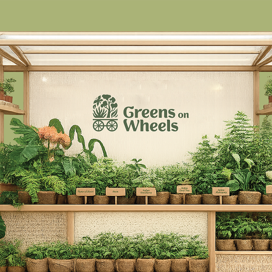
The Dynamic Logo system allows the plant composition above the cart to change while the cart itself remains constant. These evolving arrangements represent the nursery’s curated combinations of local, indigenous, and native plants — reflecting seasonality, biodiversity, and thematic planting palettes.
The Dynamic Logo system allows the plant composition above the cart to change while the cart itself remains constant. These evolving arrangements represent the nursery’s curated combinations of local, indigenous, and native plants — reflecting seasonality, biodiversity, and thematic planting palettes.



Colour System
Colour as Seasonal Logic
The colour palette is inspired by the tonal richness of plant life — a curated spectrum of greens that reflect foliage, depth, and rooted landscapes. From deep forest hues to fresh, leaf-toned greens, the primary colours ground the identity in ecology and locality. Supporting this foundation are playful accents of purple, coral, and lemon — echoing seasonal shifts, and moments of vibrancy found within native ecosystems.
The colour palette is inspired by the tonal richness of plant life — a curated spectrum of greens that reflect foliage, depth, and rooted landscapes. From deep forest hues to fresh, leaf-toned greens, the primary colours ground the identity in ecology and locality. Supporting this foundation are playful accents of purple, coral, and lemon — echoing seasonal shifts, and moments of vibrancy found within native ecosystems.


VISUAL LANGUAGE
A Living Visual Language
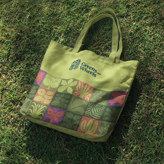
The identity functions as a flexible system where colour, pattern, and form adapt to different plant combinations — allowing the brand to evolve while remaining cohesive.
The identity functions as a flexible system where colour, pattern, and form adapt to different plant combinations — allowing the brand to evolve while remaining cohesive.


Illustrative Approach
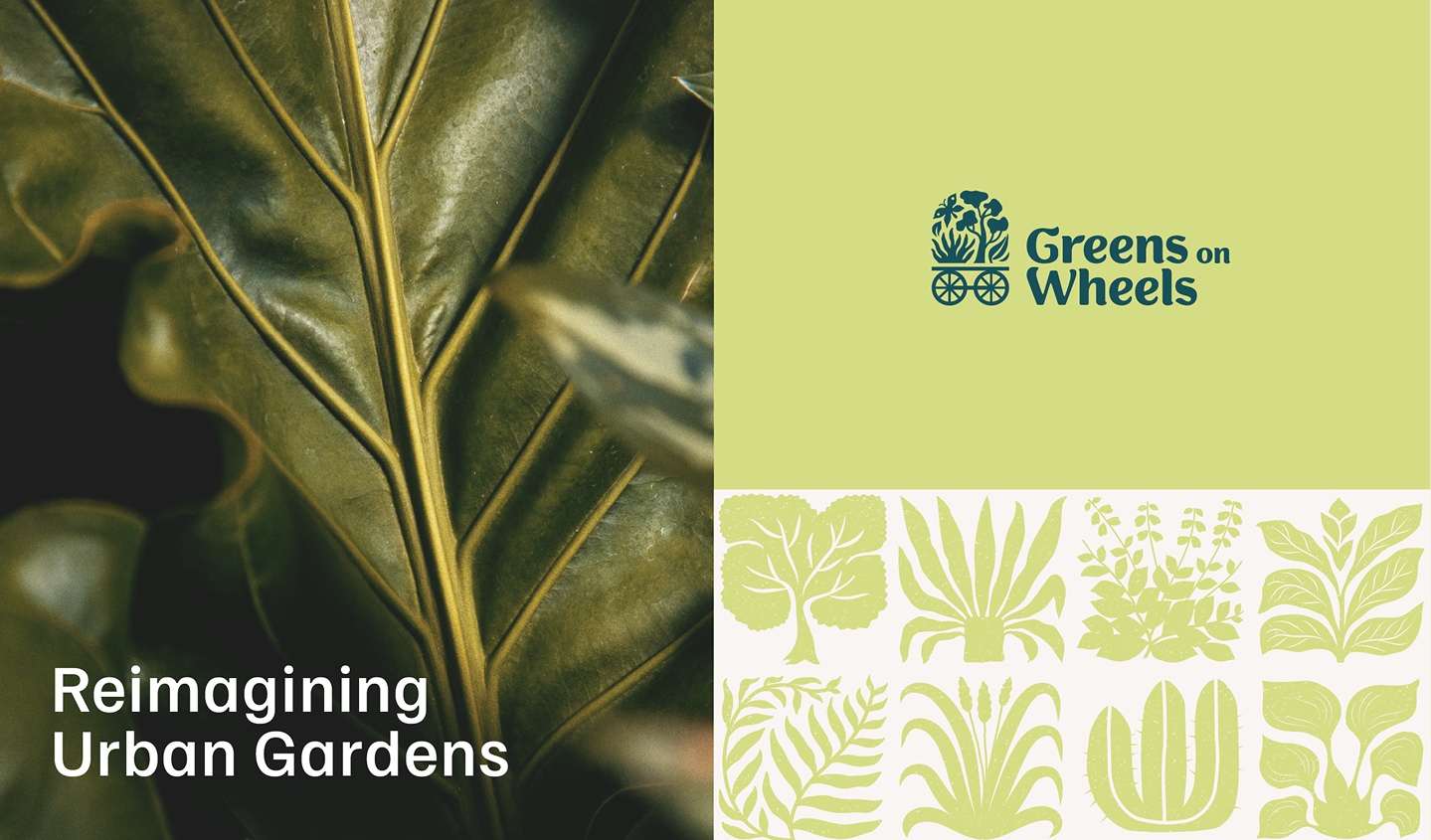
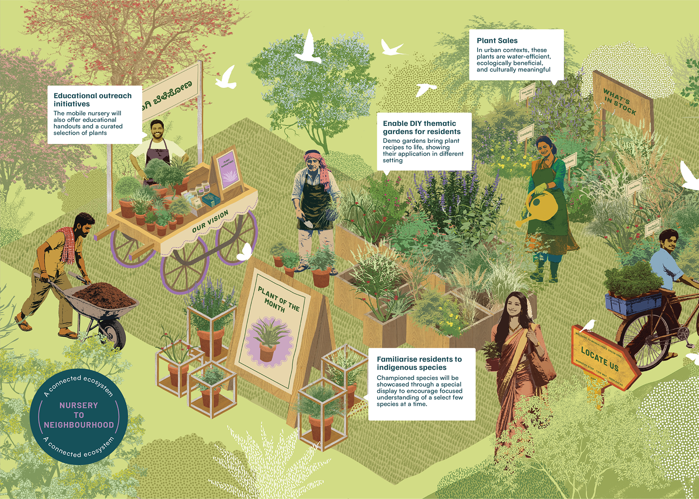
An engaging, illustrative style brings clarity and character to the different elements of the Greens on Wheels system.
An engaging, illustrative style brings clarity and character to the different elements of the Greens on Wheels system.
CREATIVE DIRECTION TRUSHA S
DESIGN PRADYUT
Trusha S
Trusha S
BRAND STRATEGY WASEEM CHISHTY
CLIENT PLUS SPACES