

From Reflection to Imagination: Translating Silver into a Visual Language
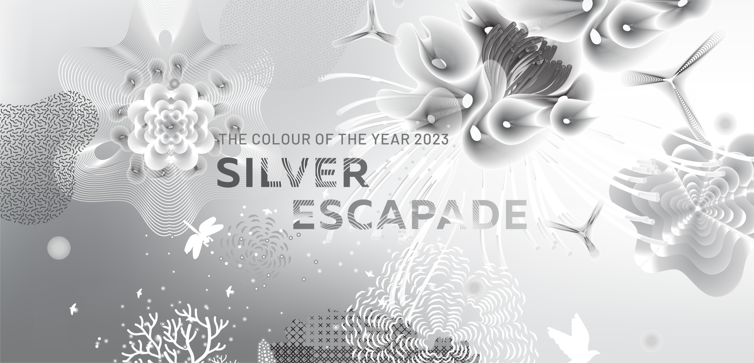
A visual system derived from Silver Escapade — a colour of transition, reflection, and optimism, translated through flowing forms, tonal gradients, and layered textures into an immersive visual language.
COLOUR STUDY
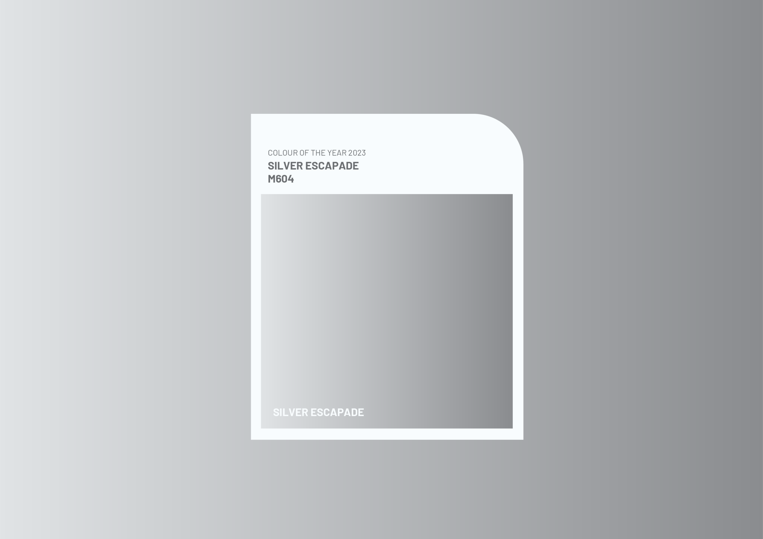
A visual exploration of Silver — translating a reflective, fluid hue into a visual language rooted in movement, introspection, imagination, and the possibility of transformation.

Essence of the Colour
Silver — A Colour of Transition
Silver Escapade explores silver as a colour of movement, reflection, and renewal. Positioned within a period of global pause and transformation, the colour represents resilience, imagination, silver linings, and forward-looking optimism. Its reflective and fluid qualities suggest a state of transition — where memory, introspection, and possibility exist simultaneously.
Silver Escapade explores silver as a colour of movement, reflection, and renewal. Positioned within a period of global pause and transformation, the colour represents resilience, imagination, silver linings, and forward-looking optimism. Its reflective and fluid qualities suggest a state of transition — where memory, introspection, and possibility exist simultaneously.
Keywords
EMOTIONAL SPECTRUM
- Reflective
- Optimistic
- Introspective
- Imaginative
- Resilient
- Expansive
- Transformative
- Hopeful
PHYSICAL SPECTRUM
- Fluid
- Luminous
- Layered
- Atmospheric
- Refractive
- Soft
- Dynamic
- Translucent



Concept
From Reflection to Movement
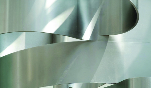
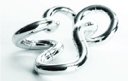
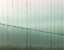
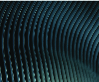
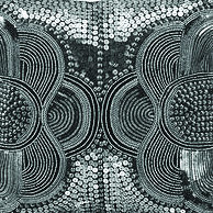
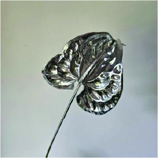
The concept explores silver through its ability to reflect, shift, and transform with its surroundings. Rather than treating it as a metallic surface, the approach considers silver as a fluid and evolving experience. References to refracted light, sculptural metal, layered textiles, and atmospheric skies informed a visual direction built around movement, illusion, and transition.
The concept explores silver through its ability to reflect, shift, and transform with its surroundings. Rather than treating it as a metallic surface, the approach considers silver as a fluid and evolving experience. References to refracted light, sculptural metal, layered textiles, and atmospheric skies informed a visual direction built around movement, illusion, and transition.

Silver Escapade imagines silver as an expansive landscape of light, fluidity, and quiet optimism.

Visual Language
A Landscape of Flow and Possibility
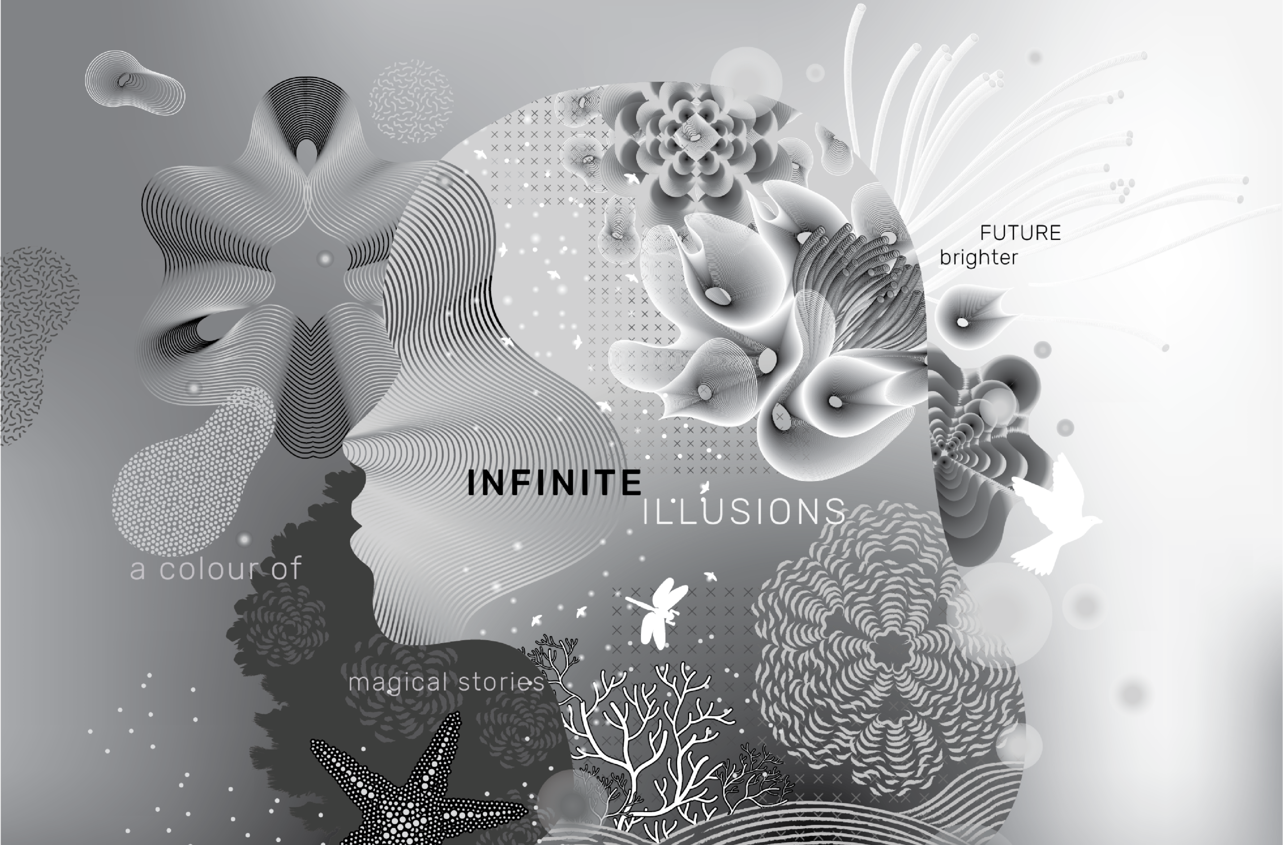
The final visual language brings together flowing linear structures, abstract organic forms, gradients, droplets, and layered transparencies. These modular elements can be scaled, layered, and recomposed to create immersive compositions. Tonal shifts and fluid forms evoke introspection, imagination, and forward motion, allowing Silver Escapade to become a dynamic visual system rather than a fixed representation of colour.
The final visual language brings together flowing linear structures, abstract organic forms, gradients, droplets, and layered transparencies. These modular elements can be scaled, layered, and recomposed to create immersive compositions. Tonal shifts and fluid forms evoke introspection, imagination, and forward motion, allowing Silver Escapade to become a dynamic visual system rather than a fixed representation of colour.

SYSTEM APPLICATION
Extending Silver Across Formats
The visual system was applied across multiple editorial formats and printed collaterals, demonstrating its flexibility and consistency. Flowing forms, layered textures, gradients, and graphic modules could be recomposed across different scales and compositions. Through these applications, Silver Escapade becomes a storytelling framework that carries ideas of memory, transition, and quiet optimism across formats.
The visual system was applied across multiple editorial formats and printed collaterals, demonstrating its flexibility and consistency. Flowing forms, layered textures, gradients, and graphic modules could be recomposed across different scales and compositions. Through these applications, Silver Escapade becomes a storytelling framework that carries ideas of memory, transition, and quiet optimism across formats.
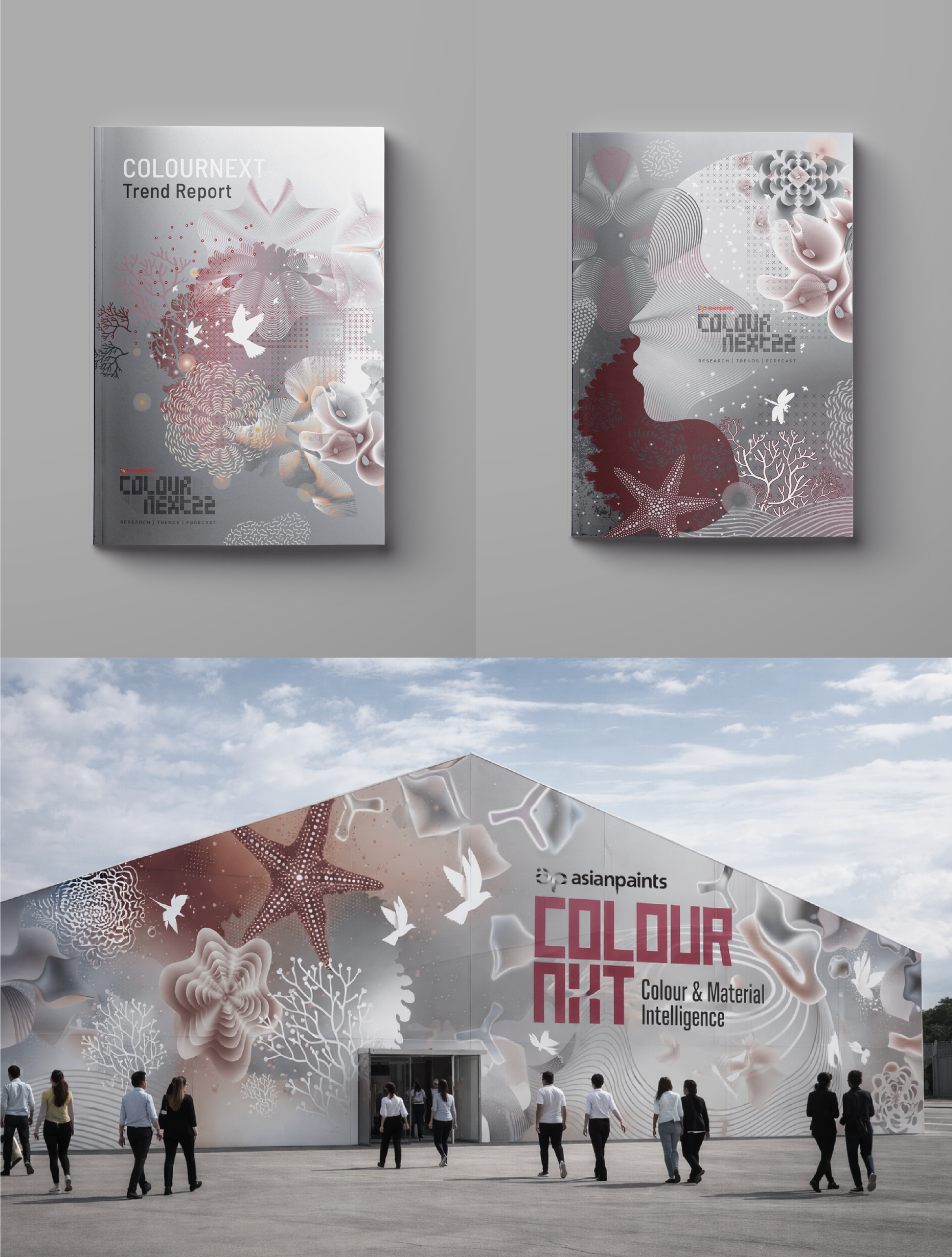
Illustration & Visual LanguageTrusha S
Collaboration STUDIO WARIWATAI
Client COLOURNEXT ASIANPAINTS