
Designing a Living Archive of Water, Memory, and Futures
A series of eight books that unfold as a fluid archive — weaving together ecology, memory, and speculative futures through layered visual and narrative structures.
THE CHALLENGE
How do we create a cohesive identity for eight distinct books — spanning essays, fiction, and photo narratives — while allowing each to retain its own voice? And how can an underlying visual system organise fluid themes of land, water, and ecology without making them feel rigid or uniform?

The Concept
Fluid Frameworks
A series of eight interconnected books that navigate water, land, and ecological memory through varied narrative forms — essays, fiction, and photo essays.
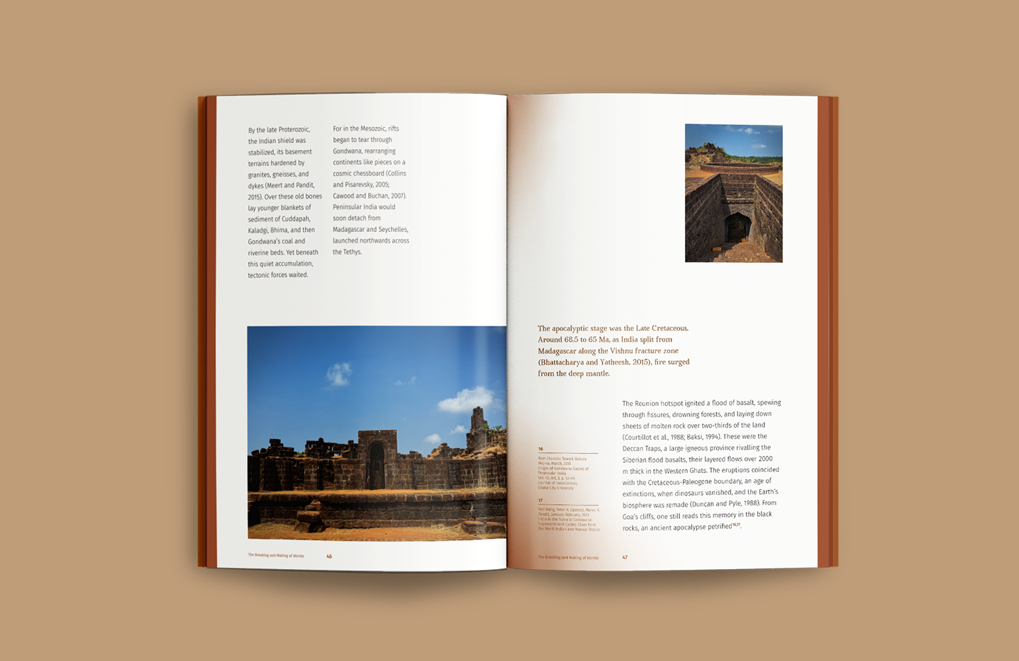
The design approach builds a flexible system where content type and thematic lens intersect. Each book sits within a larger matrix — defined by colour, typography, and layout logic — allowing for distinct expressions while remaining visually and conceptually unified.
A series of eight interconnected books that navigate water, land, and ecological memory through varied narrative forms — essays, fiction, and photo essays.
The design approach builds a flexible system where content type and thematic lens intersect. Each book sits within a larger matrix — defined by colour, typography, and layout logic — allowing for distinct expressions while remaining visually and conceptually unified.
Colour System
Ecologies in Palette
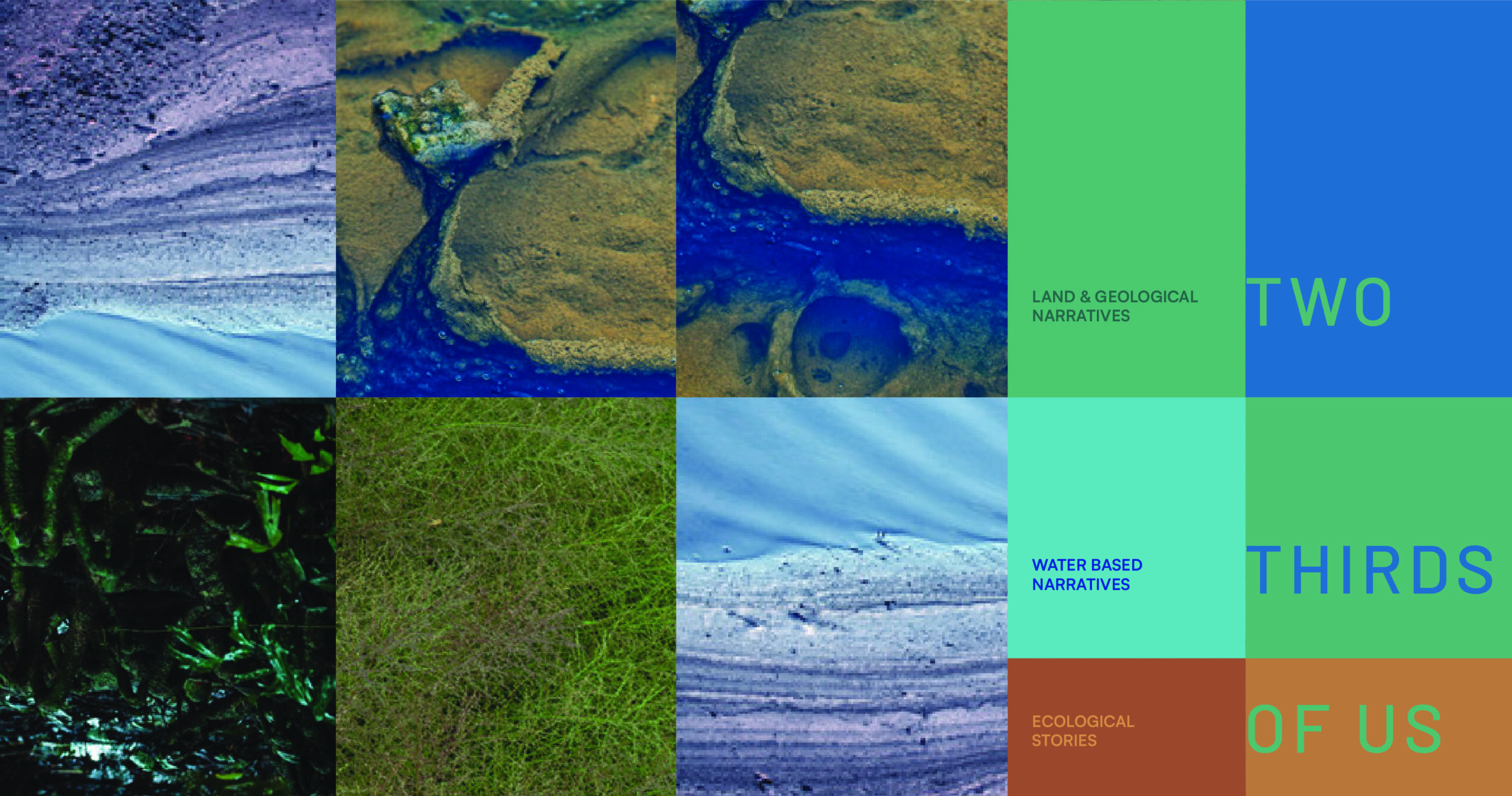
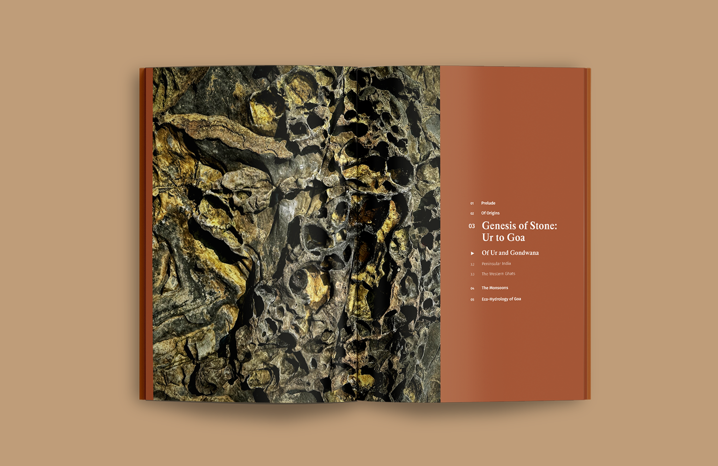
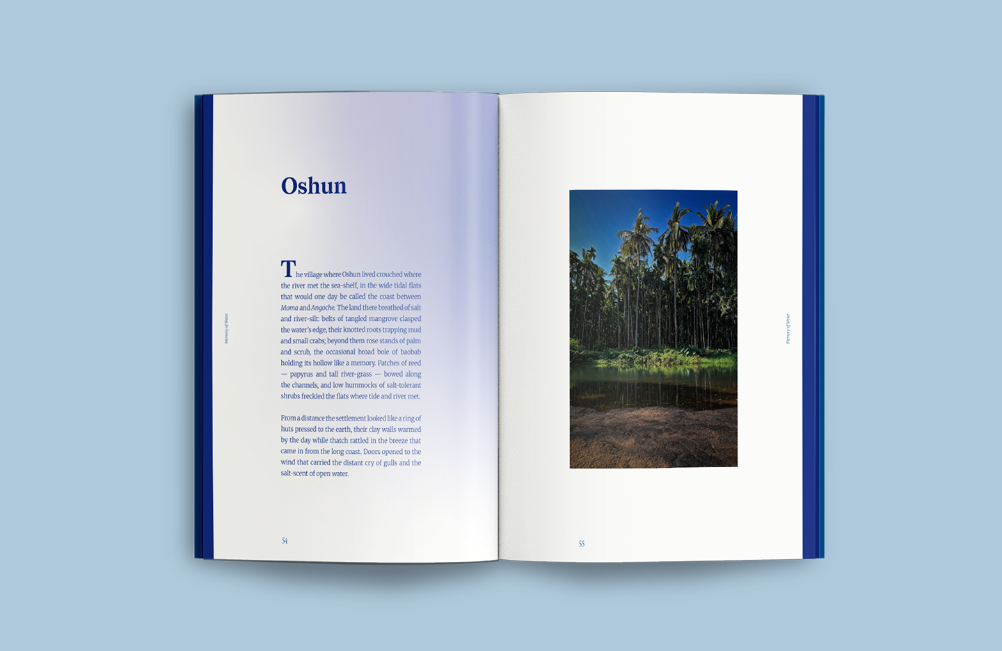
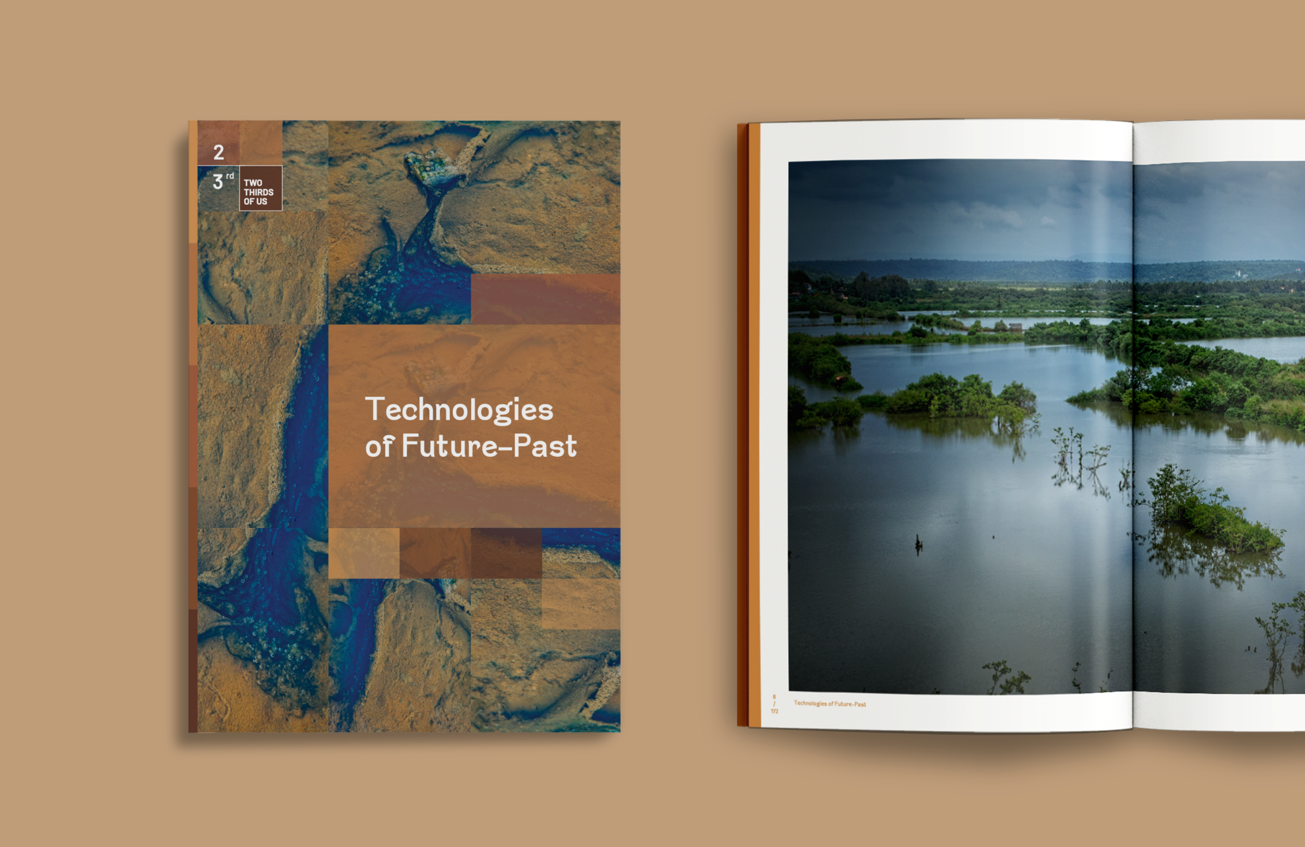
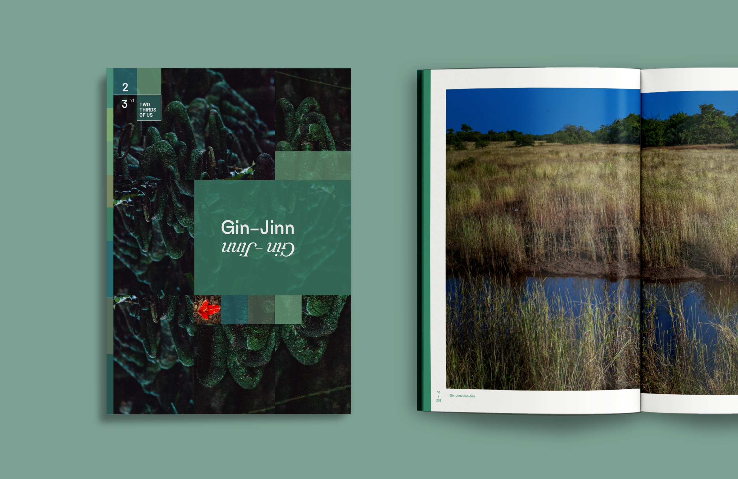
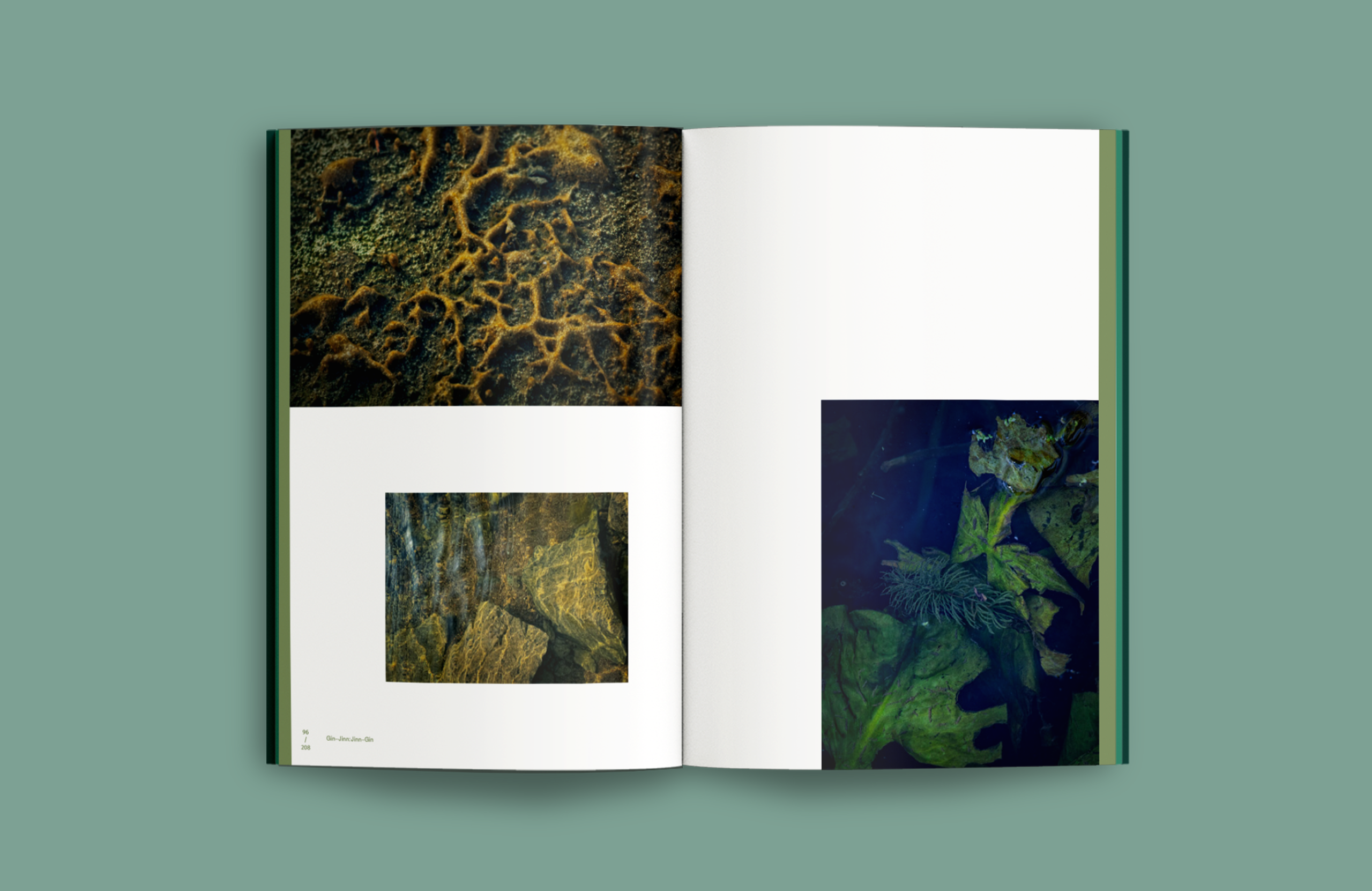
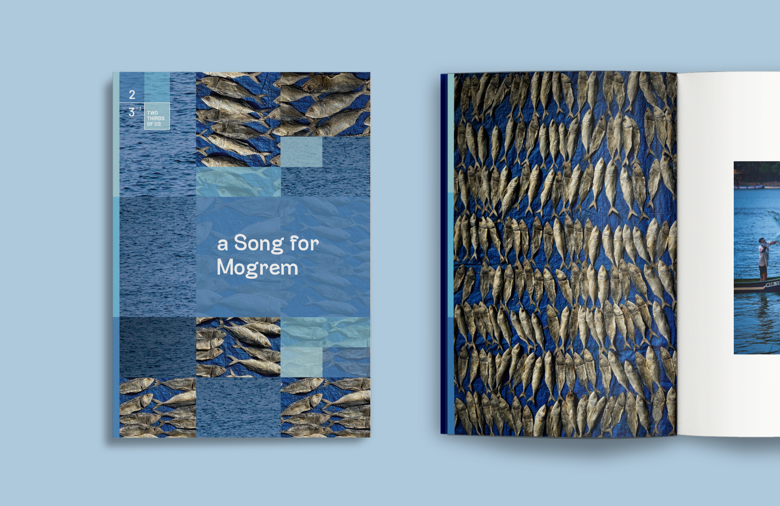
A set of colour palettes anchors the thematic landscape of the series - Blues for water-based narratives, Greens for forest and ecological stories, Earth and ochre tones for land, geology, and histories of extraction. Colour works as both identifier and connector — mapping each book to its ecological context while tying the series together.
A set of colour palettes anchors the thematic landscape of the series - Blues for water-based narratives, Greens for forest and ecological stories, Earth and ochre tones for land, geology, and histories of extraction. Colour works as both identifier and connector — mapping each book to its ecological context while tying the series together.


Typography
Voices of Form
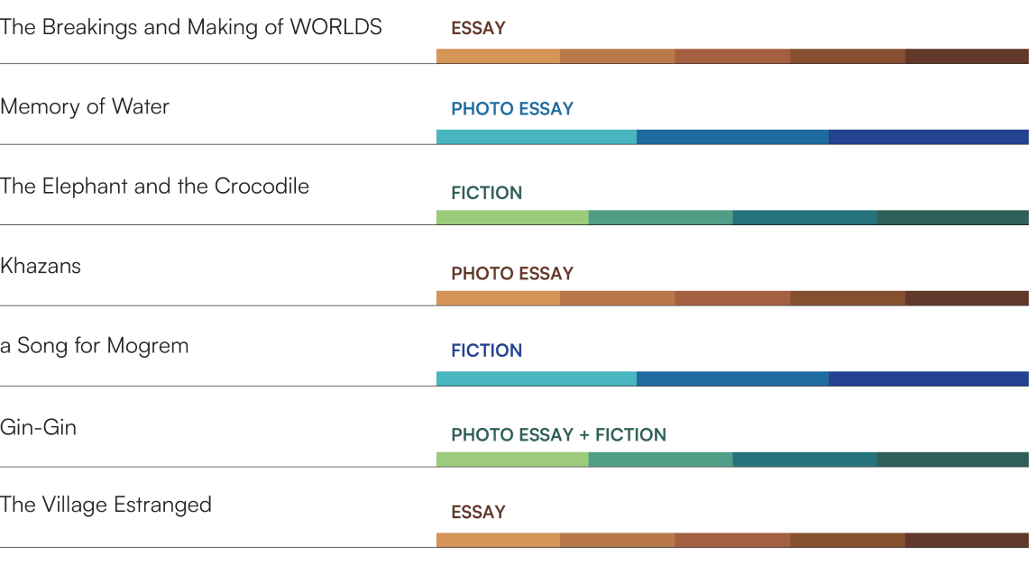
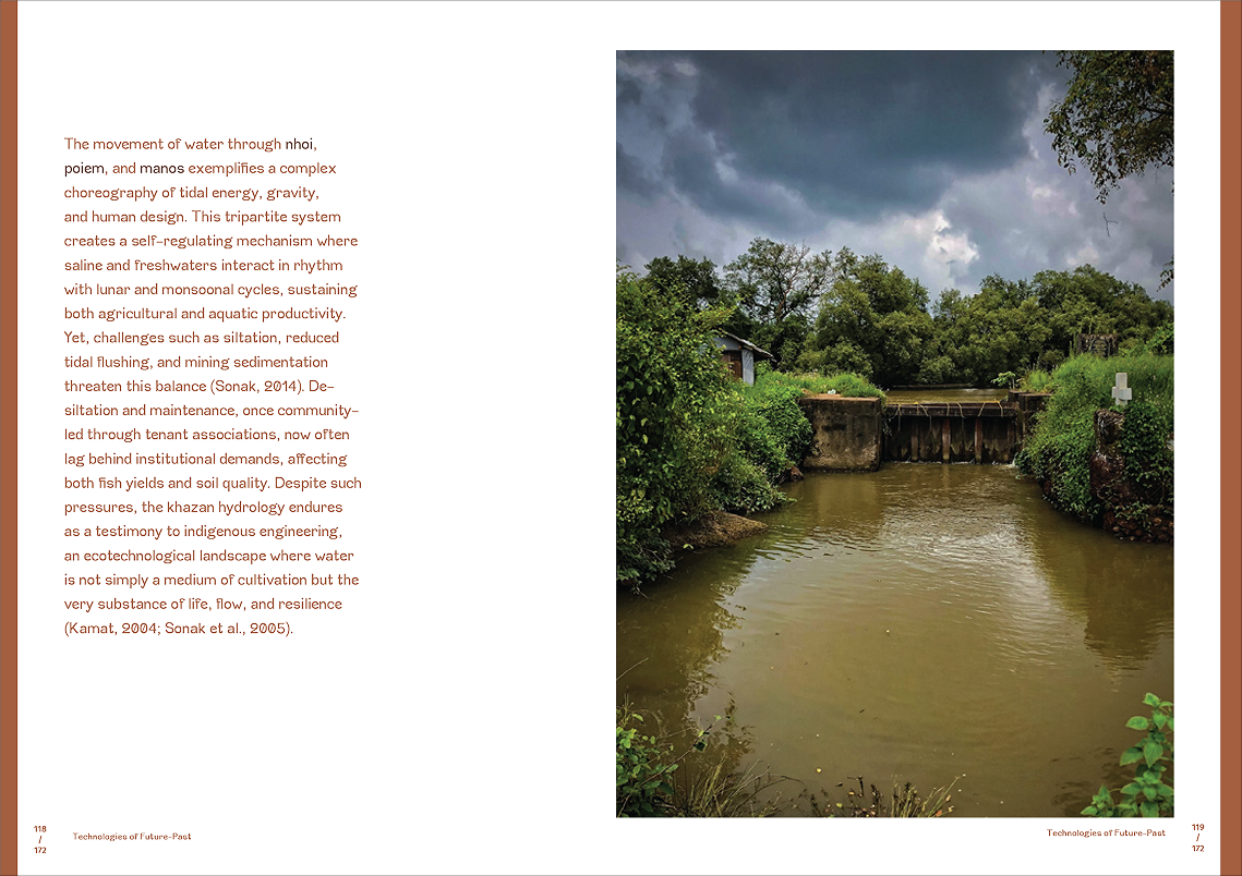
Typography adapts to the narrative format — each book follows a distinct typographic system based on whether it is fiction, essay, or photo essay. These shifts shape how the content is read, experienced, and navigated. Each typology uses a dedicated set of title and body typefaces, creating a clear and unique reading voice.
Typography adapts to the narrative format — each book follows a distinct typographic system based on whether it is fiction, essay, or photo essay. These shifts shape how the content is read, experienced, and navigated. Each typology uses a dedicated set of title and body typefaces, creating a clear and unique reading voice.
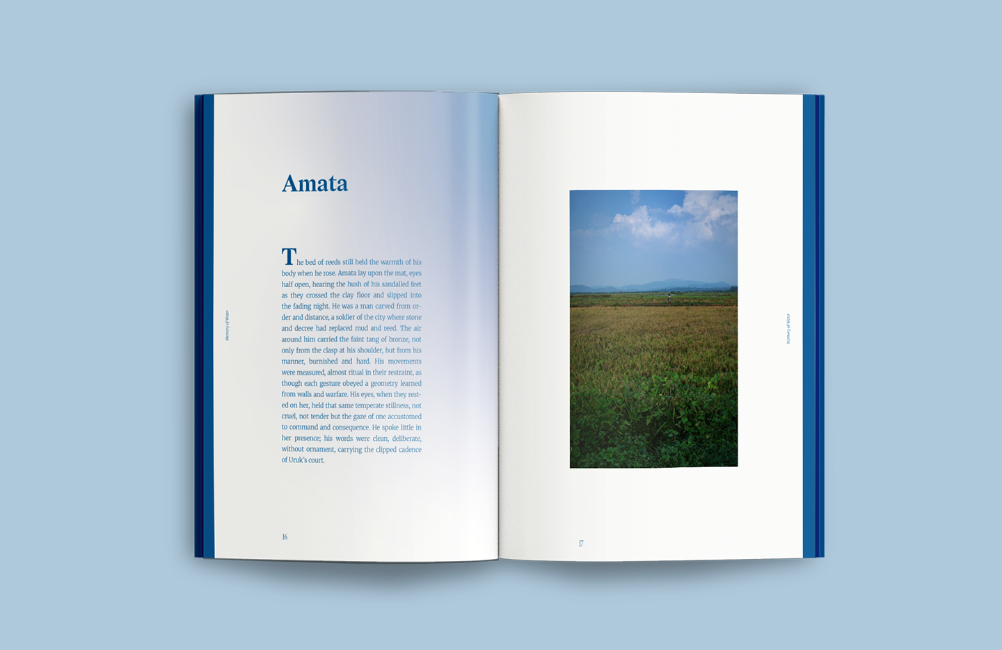
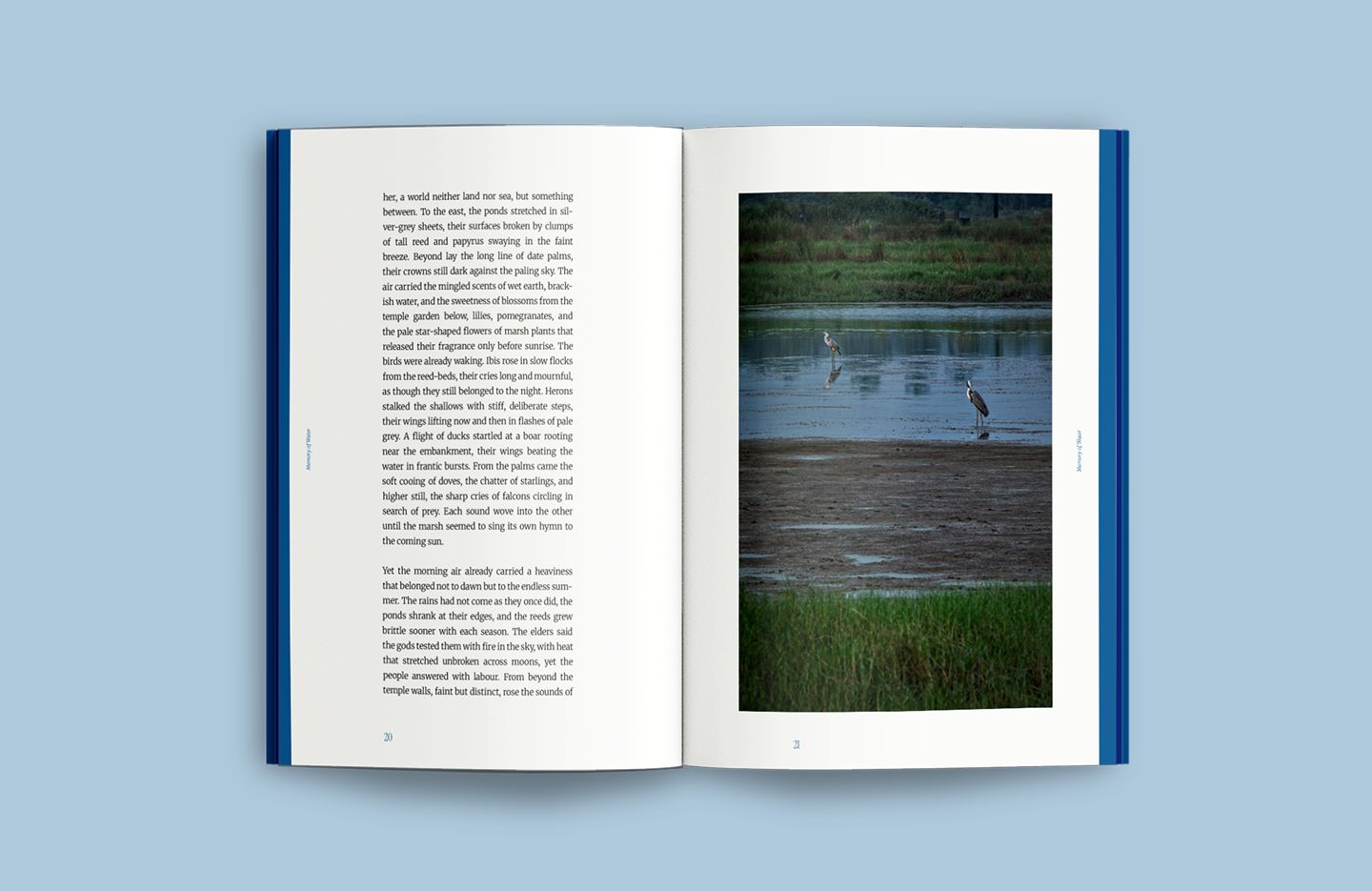
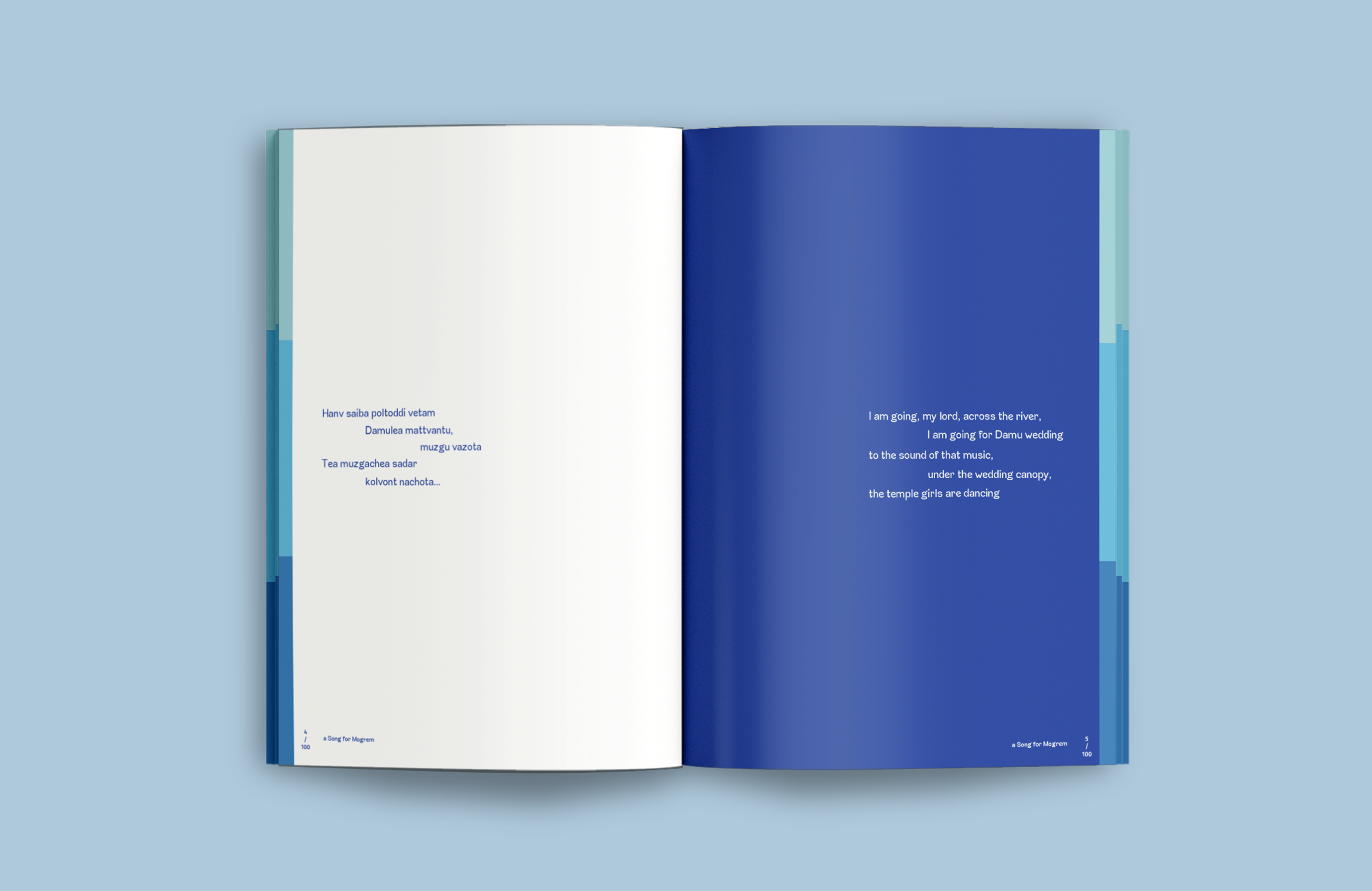
Fiction: Immersive & Classic Designed with the sensibility of a traditional fiction book — generous margins, centred imagery, and a steady, immersive reading rhythm.

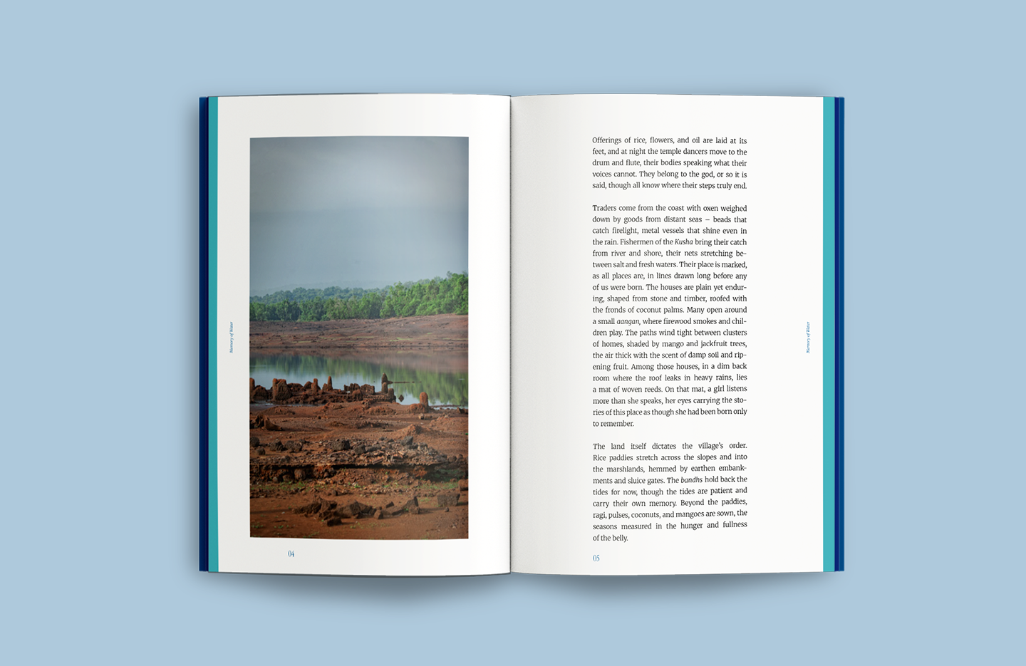
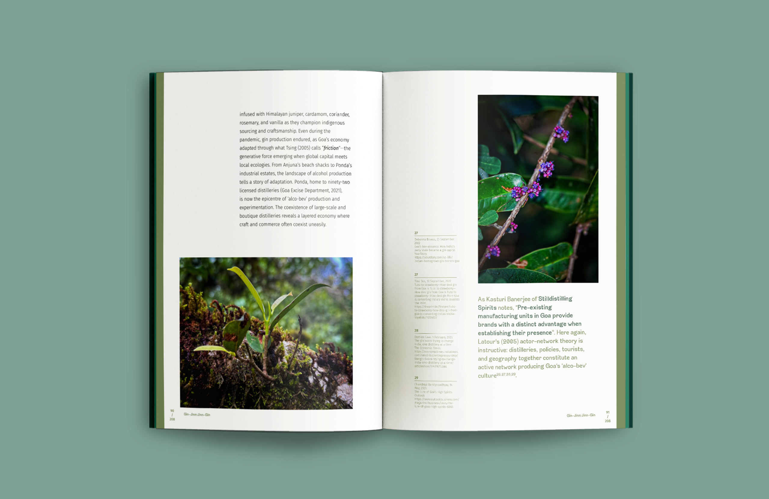
Essays: Structured & Discursive A more structured, research-led layout where text leads the narrative. Pull quotes and images are interspersed within the flow, creating pauses and emphasis while supporting clarity and readability.
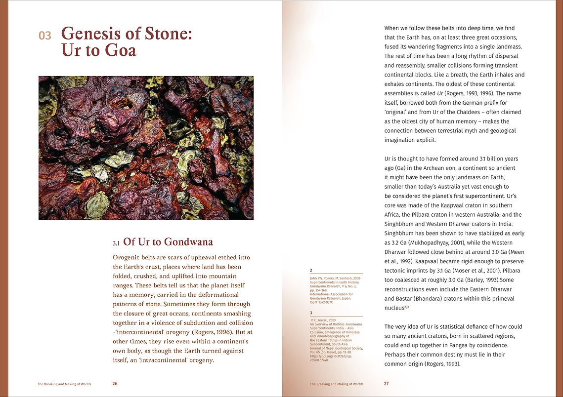
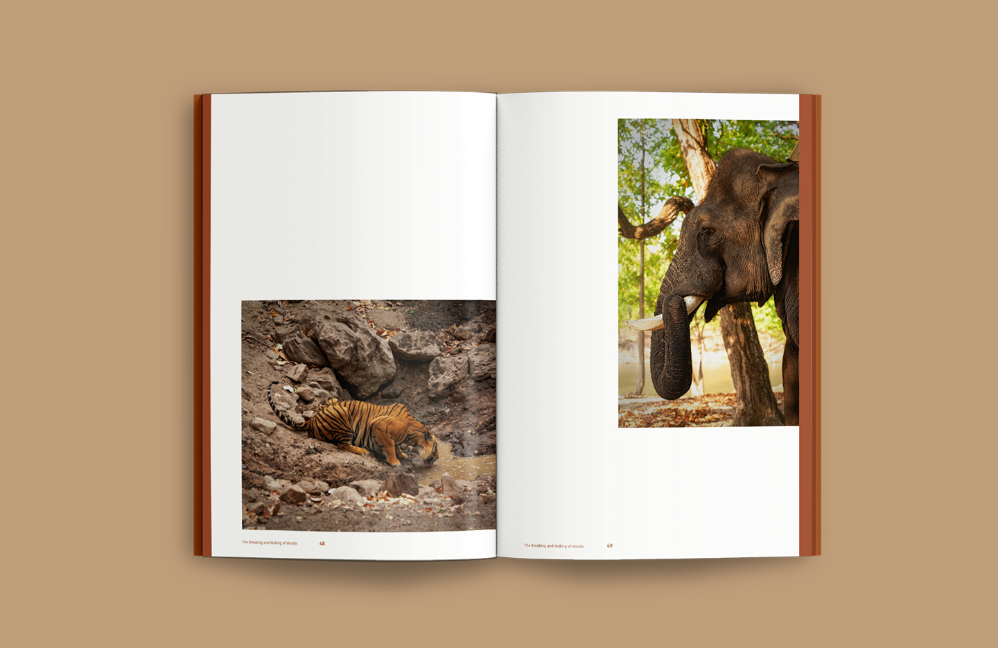
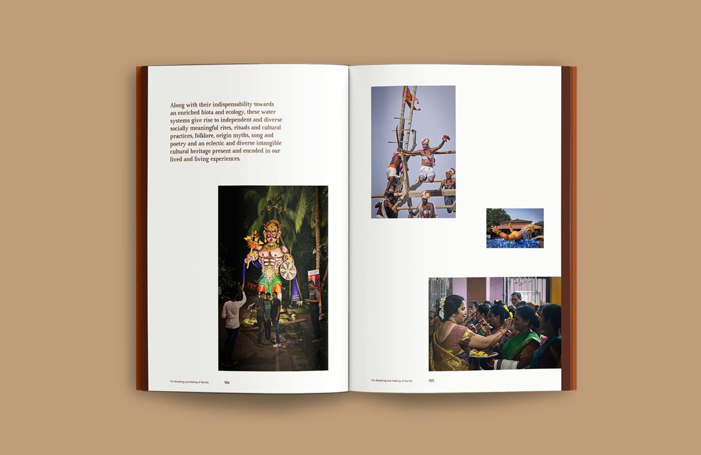
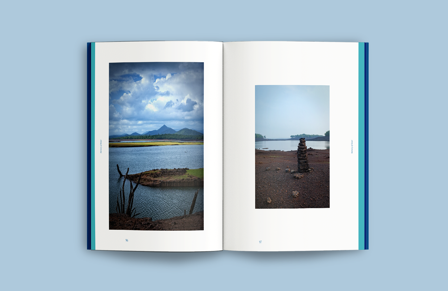
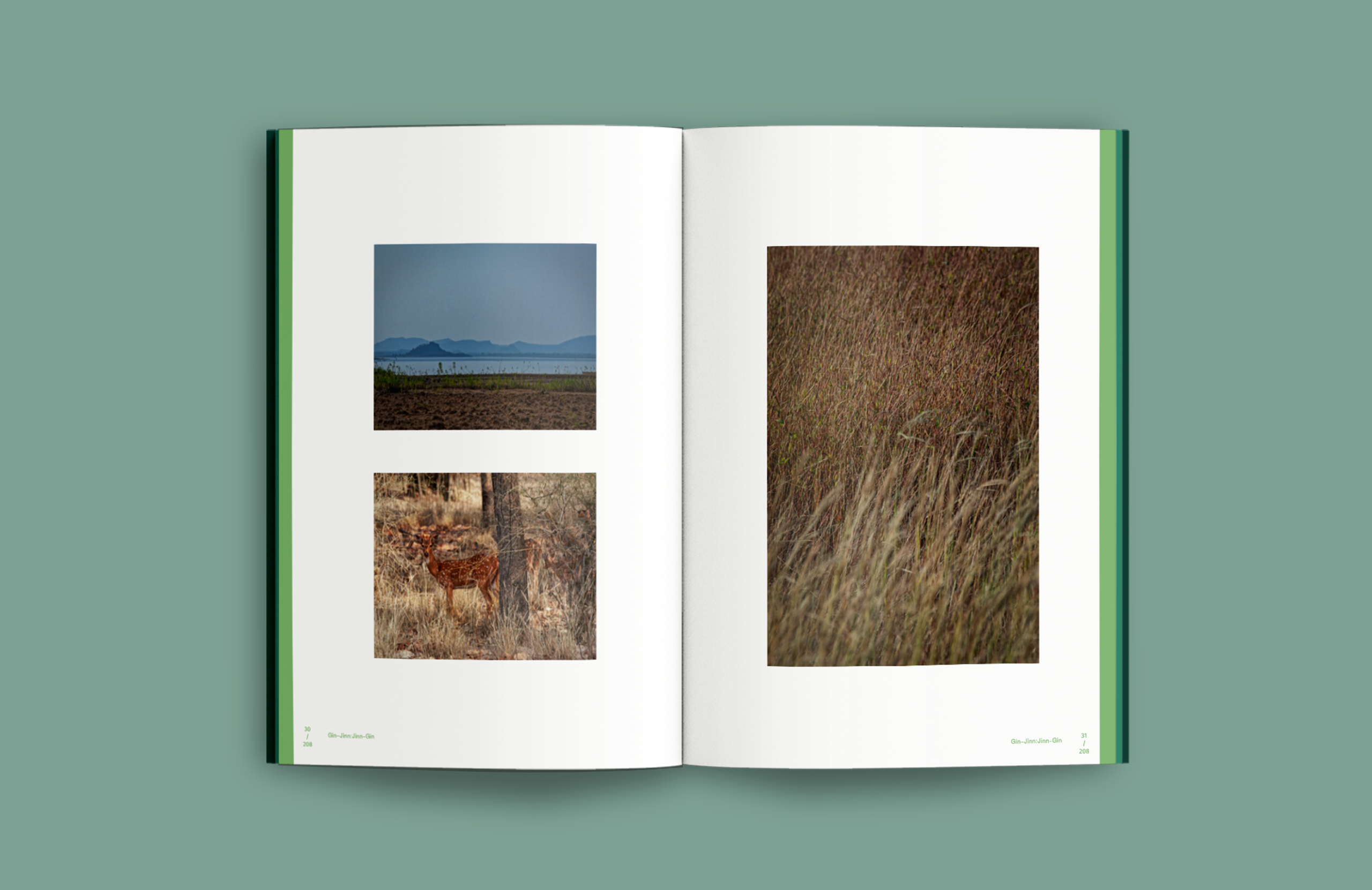
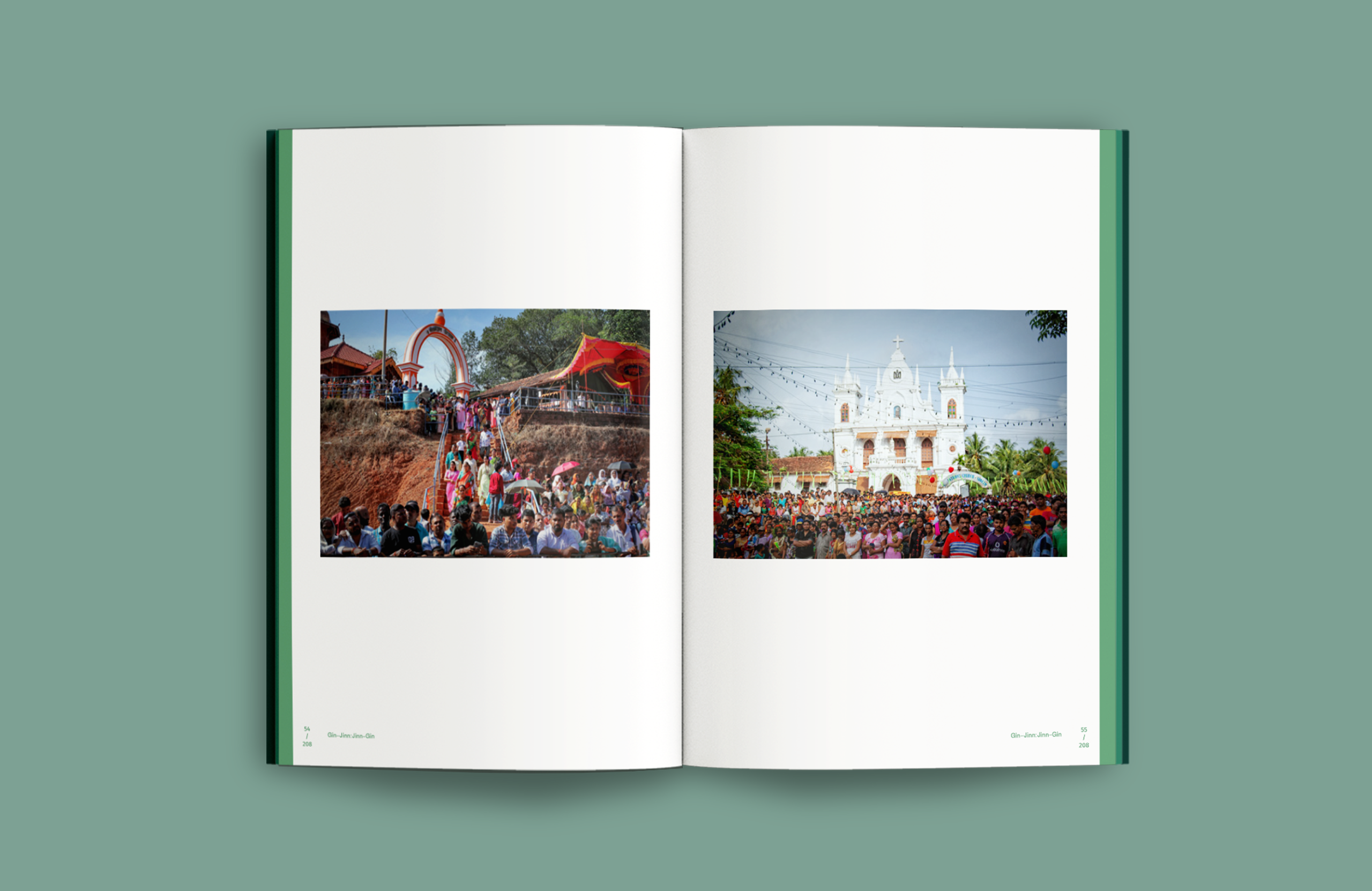
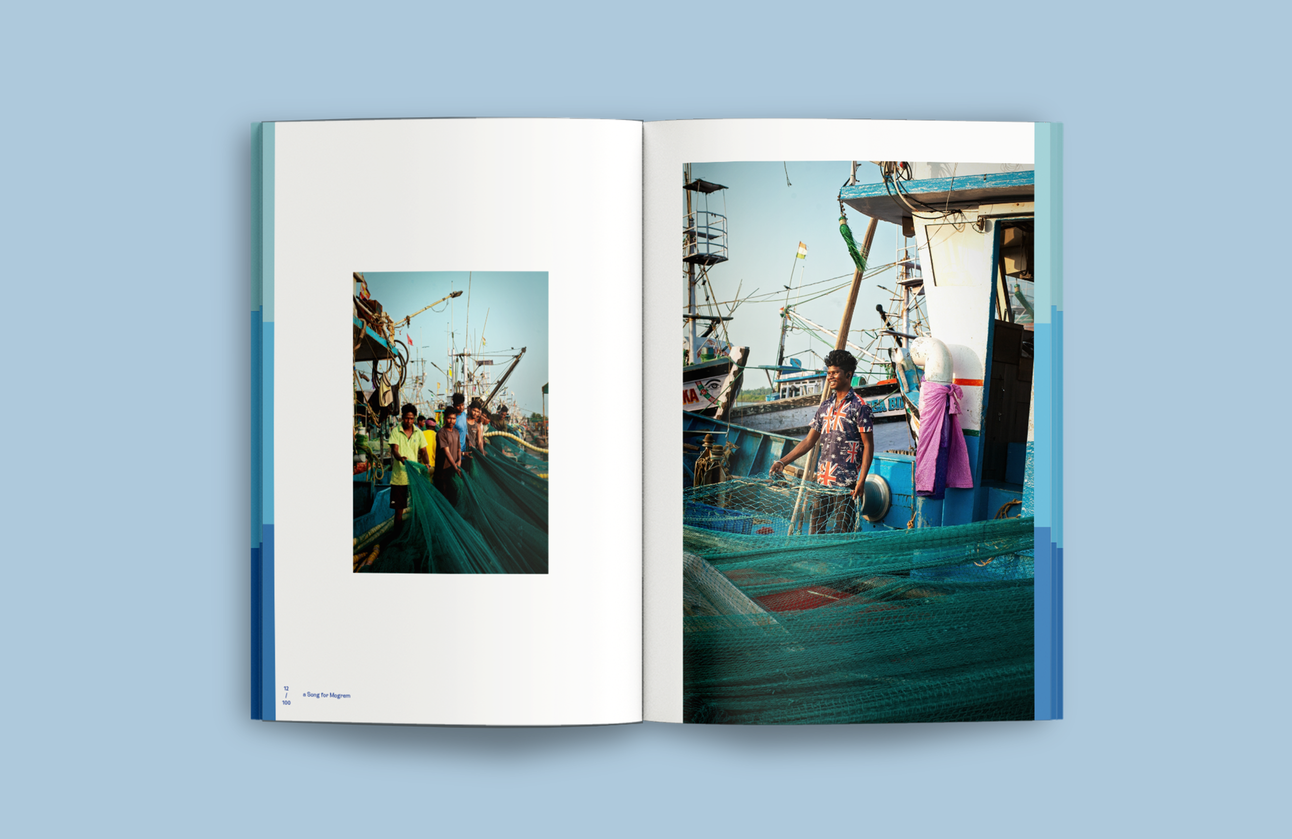
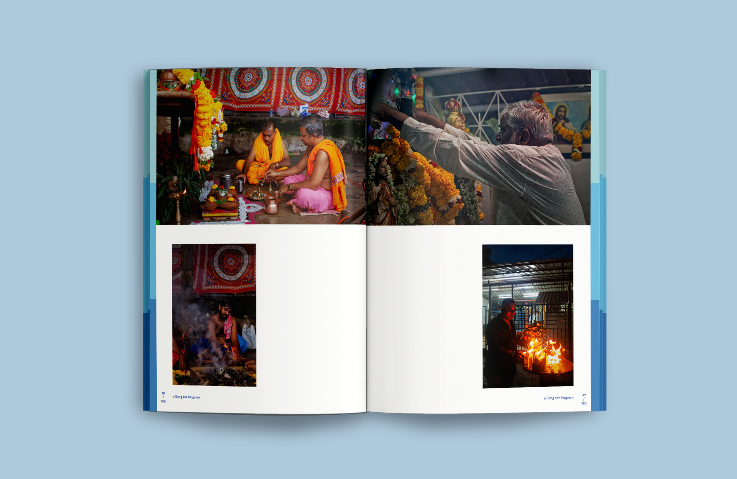
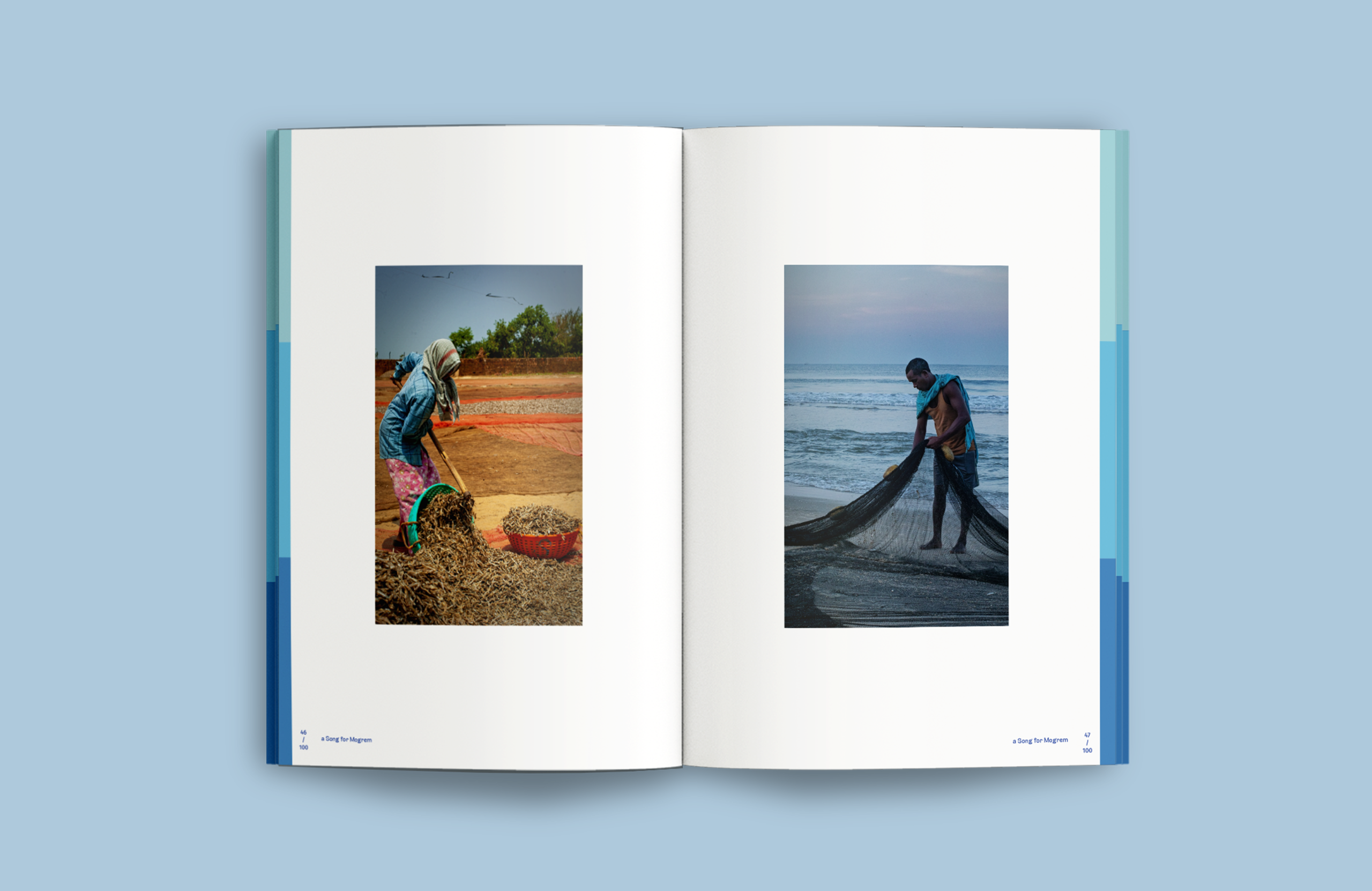
Photo Essays: Visual Narratives Image-led compositions where photographs drive the storytelling. Text appears sparingly — as captions or short interventions — offering context without interrupting the visual flow.
THE OUTCOME
Eight Expressions Within One System
The identity is built through a matrix of permutations: content type × thematic category.
This creates a repeatable yet flexible design logic — where, for example, a water + fiction book follows a distinct visual behaviour compared to a land + essay. The result is a system that balances consistency with variation — allowing each book to feel authored, yet part of a larger conversation.
The identity is built through a matrix of permutations: content type × thematic category.
This creates a repeatable yet flexible design logic — where, for example, a water + fiction book follows a distinct visual behaviour compared to a land + essay. The result is a system that balances consistency with variation — allowing each book to feel authored, yet part of a larger conversation.












CREATIVE DIRECTION Trusha S
DESIGN AKANSHA SAIN
TRUSHA S
TRUSHA S
CURATION & PHOTOGRAPHY
& WRITING WENCY MENDES
& WRITING WENCY MENDES
CLIENT WENCY MENDES