Branding, Illustration, Visual Language
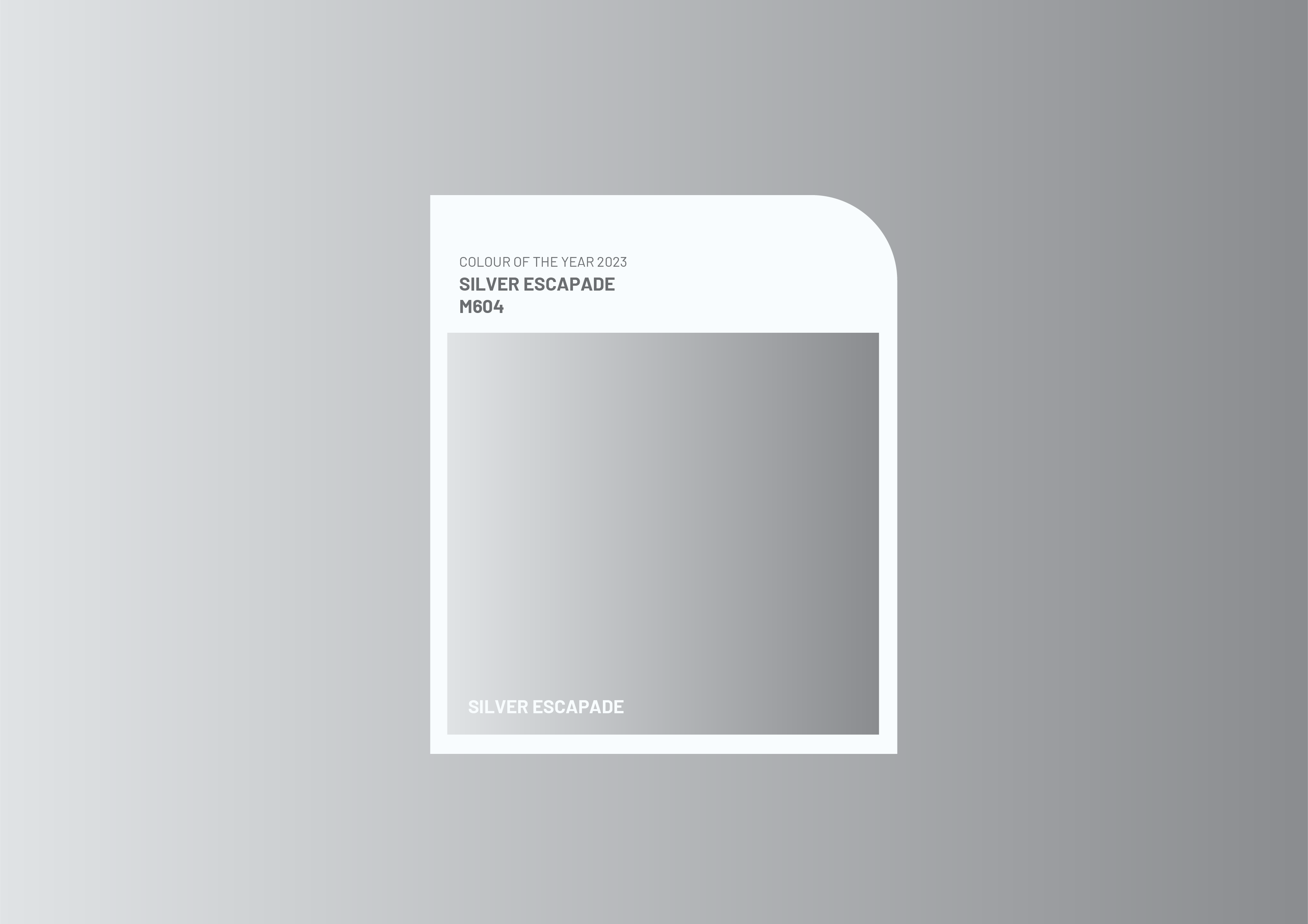
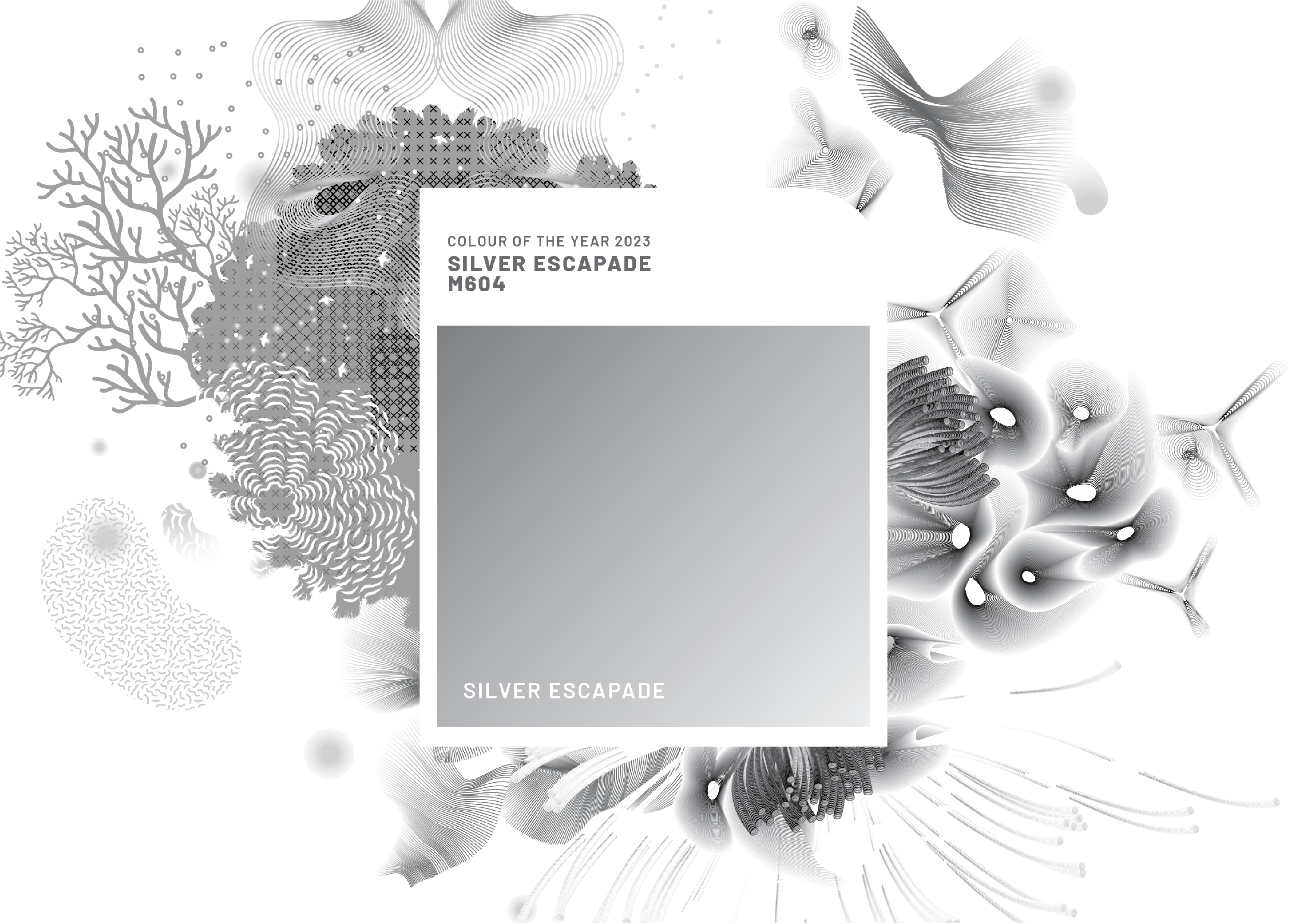
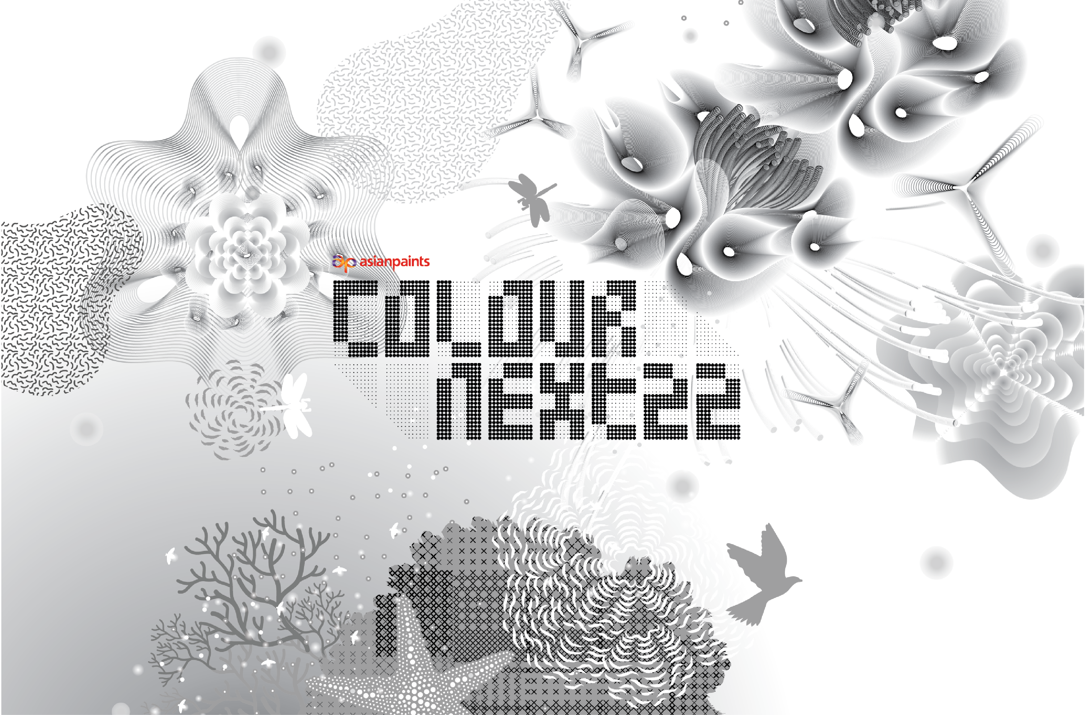
ColourNext 2023: Silver Escapade Visual Language
Silver as a colour of transition — explored through a modular visual system of flowing forms, gradients, and layered textures.
ColourNext is a prominent colour forecasting platform within the Indian design ecosystem, widely referenced across interior design, architecture, and visual communication. Its annual colour narratives shape how colour is interpreted and applied across exhibitions, publications, and design-led spaces.
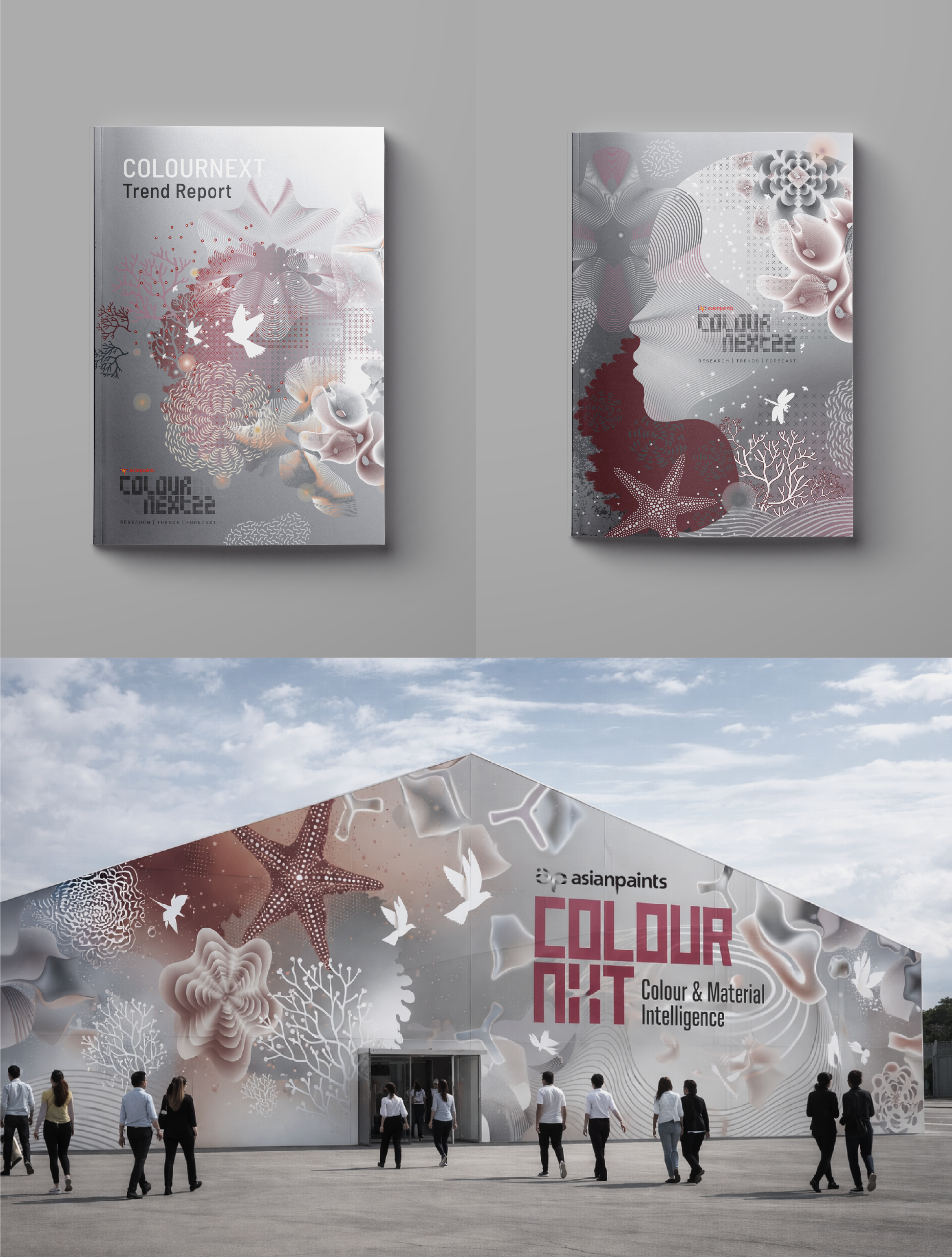
This project began with a single colour and its associated emotional narrative. The challenge was to translate an abstract colour intent into a coherent visual language—one that could live consistently across multiple formats, from editorial covers to printed collaterals.
The outcome is a system of illustrations, patterns, and forms that interpret the colour through texture, material memory, and emotion—allowing the hue to become experiential rather than purely decorative.
This design exploration was developed as part of a consultancy engagement with Studio Wariwatai*
Brief
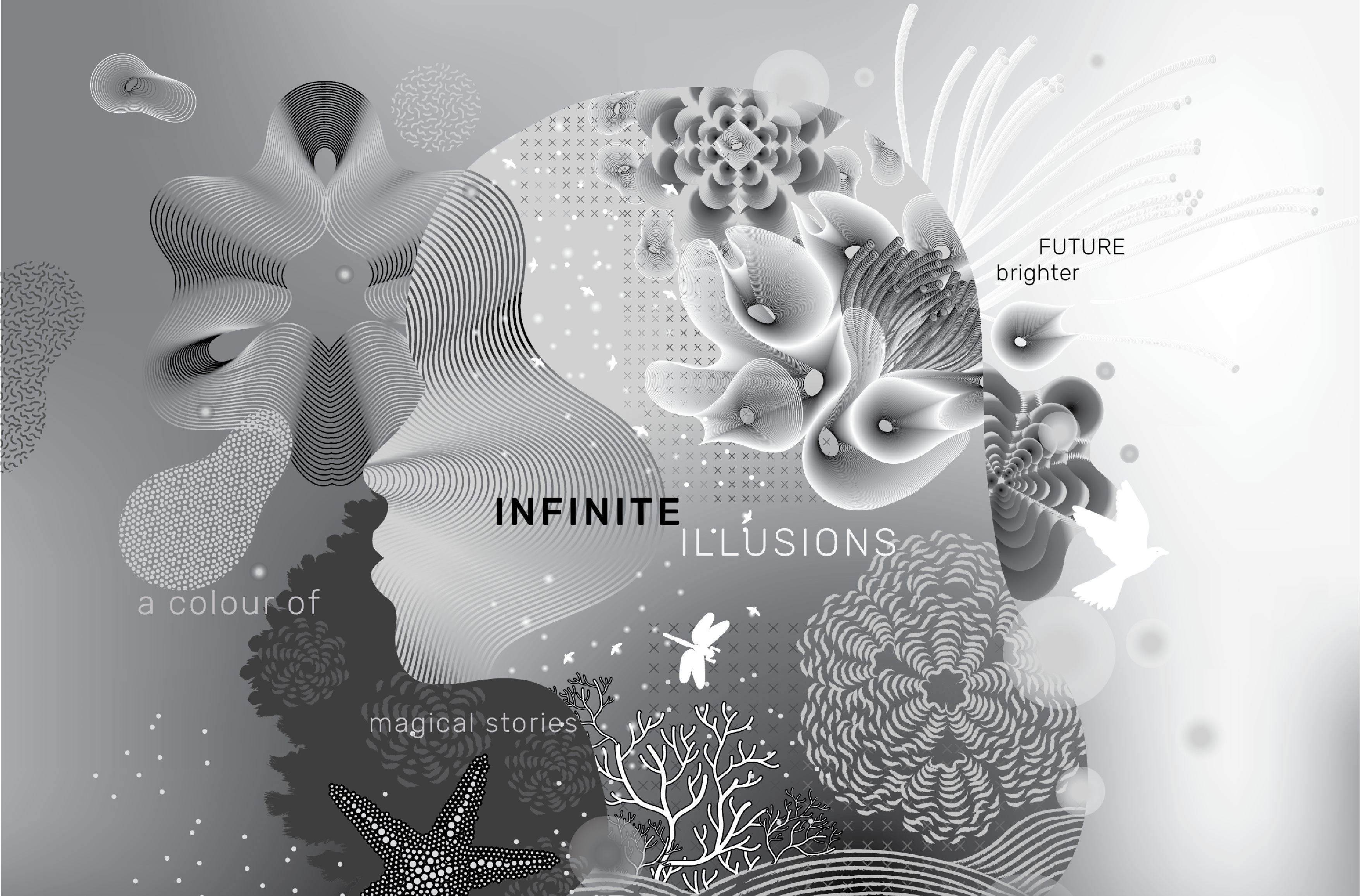
Silver was introduced as a colour of transition — reflective, fluid, and symbolic of movement across time. Positioned within a moment of global pause and renewal, it represented resilience, silver linings, imagination, and a forward-looking optimism.
The challenge was to translate this abstract emotional narrative into a cohesive visual language — one that could live across print and spatial applications while retaining conceptual depth.
Approach
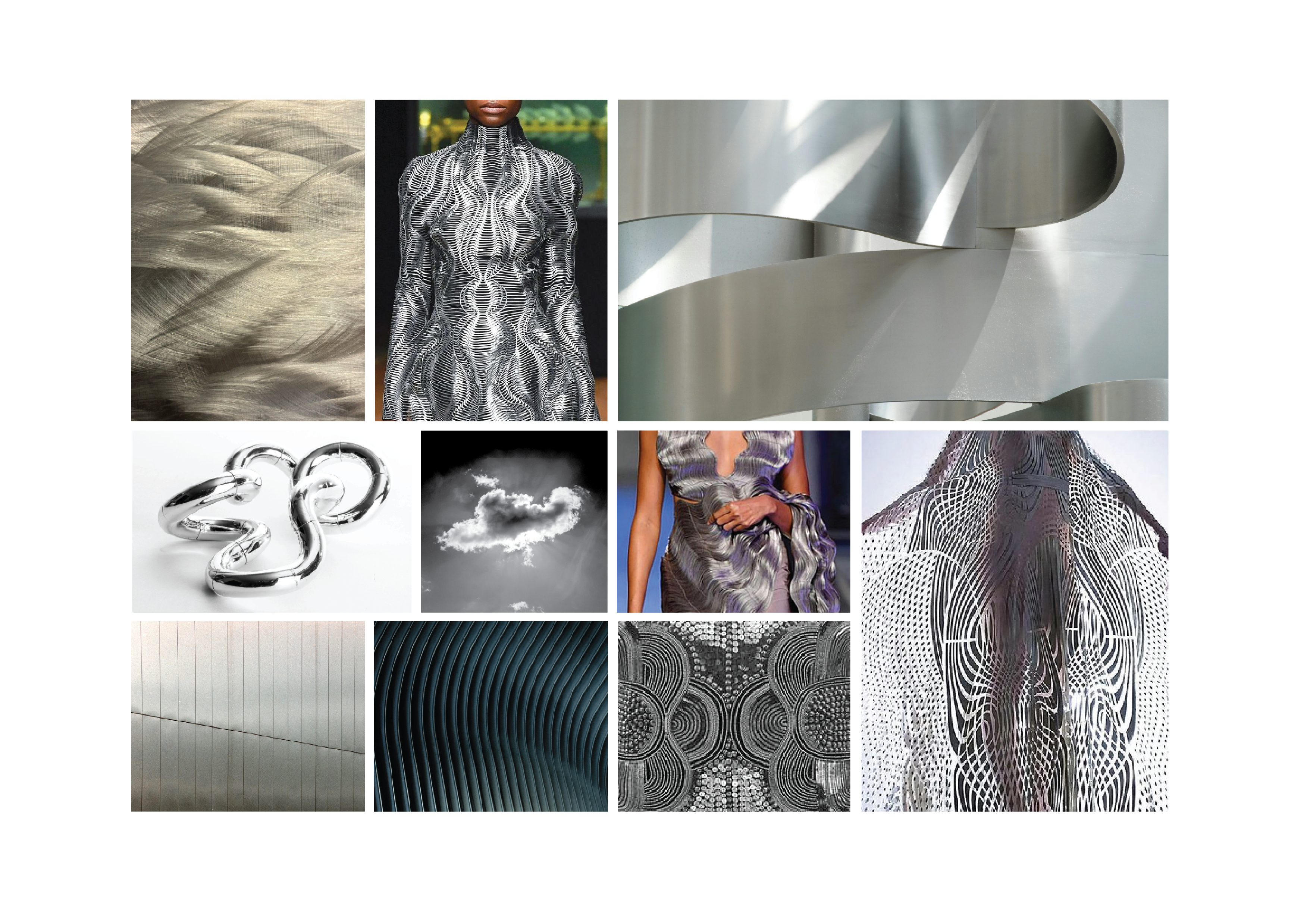
Rather than treating silver as a metallic finish, the exploration focused on its behaviour: how it reflects light, shifts tone, and transforms depending on context.
A moodboard was developed to capture ideas of fluidity, illusion, and movement. References ranged from sculptural metal and layered textiles to atmospheric skies and refracted light — all suggesting transition rather than stasis.
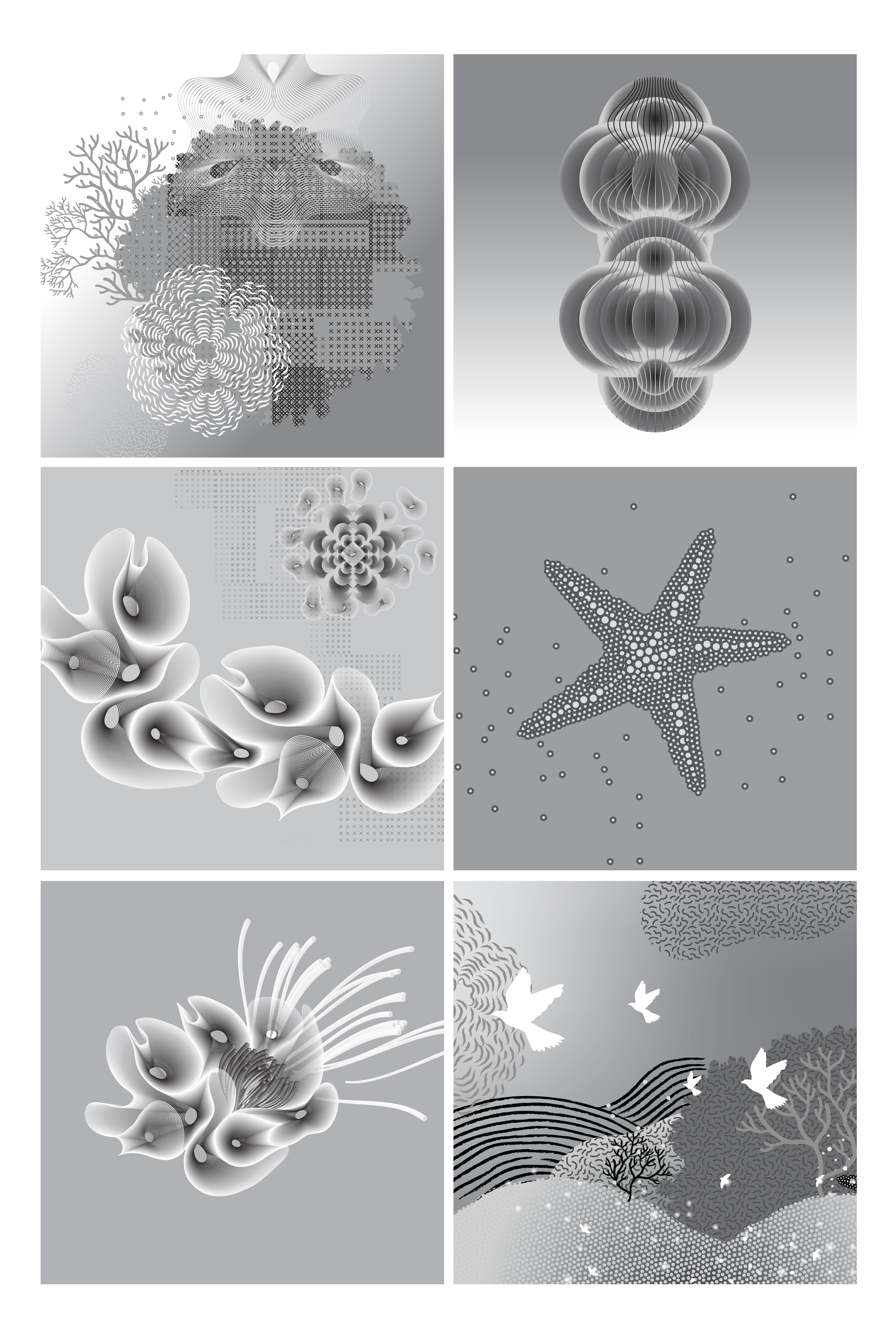
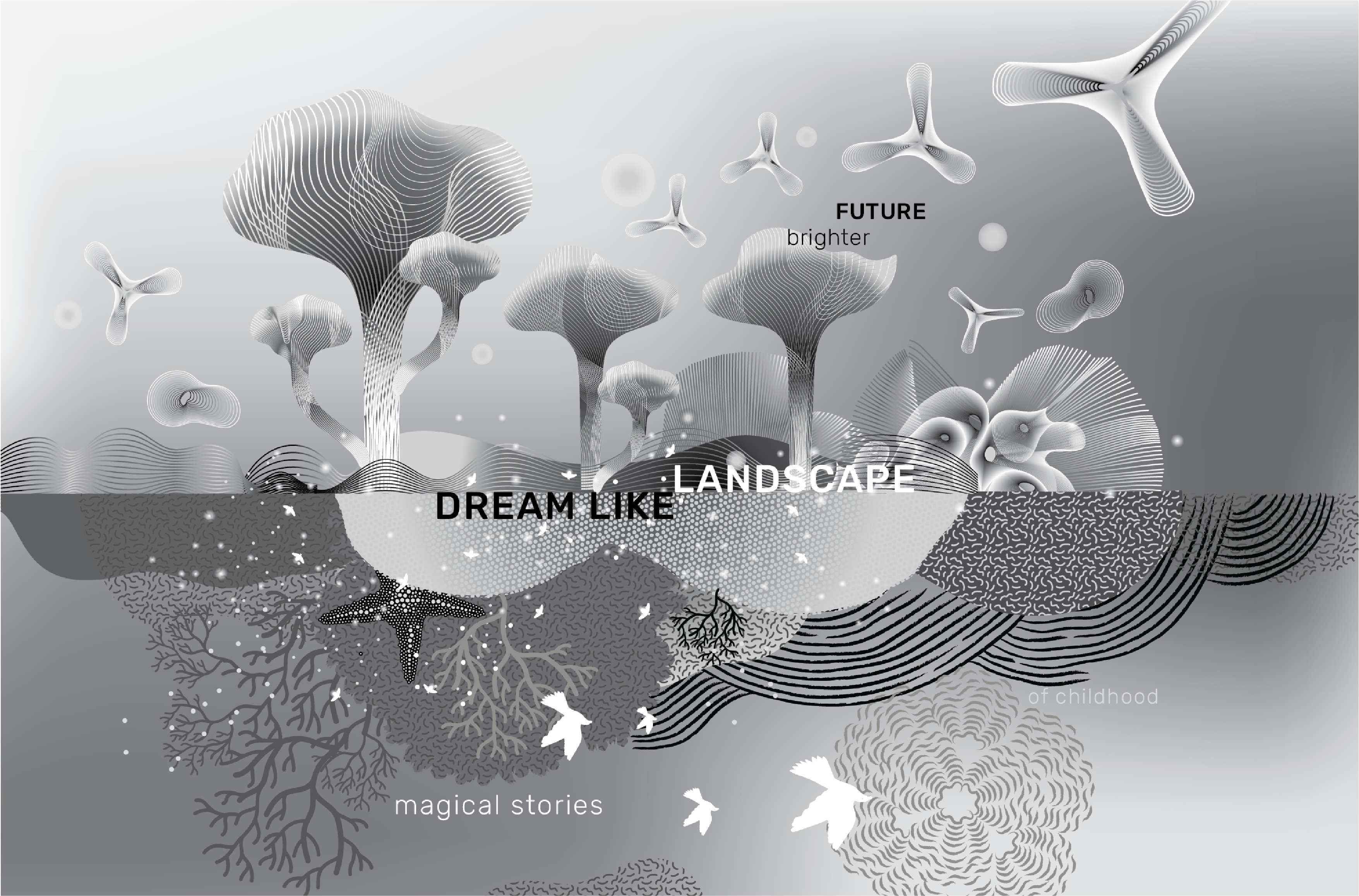
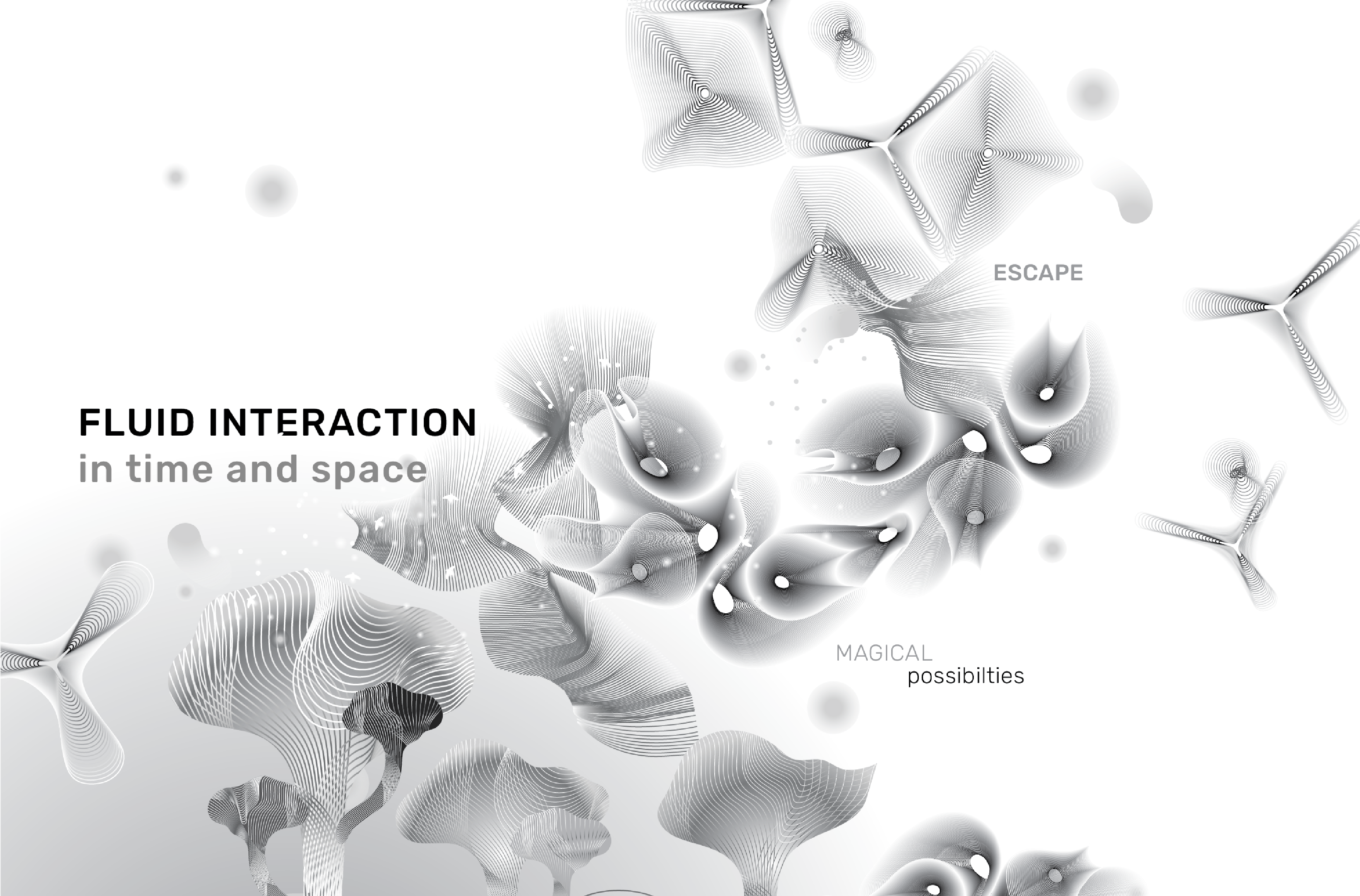
From this foundation, smaller visual modules were created — flowing linear structures, abstract organic forms, gradients, droplets, and layered textures. Each element carried a fragment of the narrative: movement as travel, reflection as introspection, luminosity as resilience.
Research Moodboard — images used under fair use for educational and reference purposes only. All rights belong to their respective owners. Not used for commercial distribution.
Visual Language
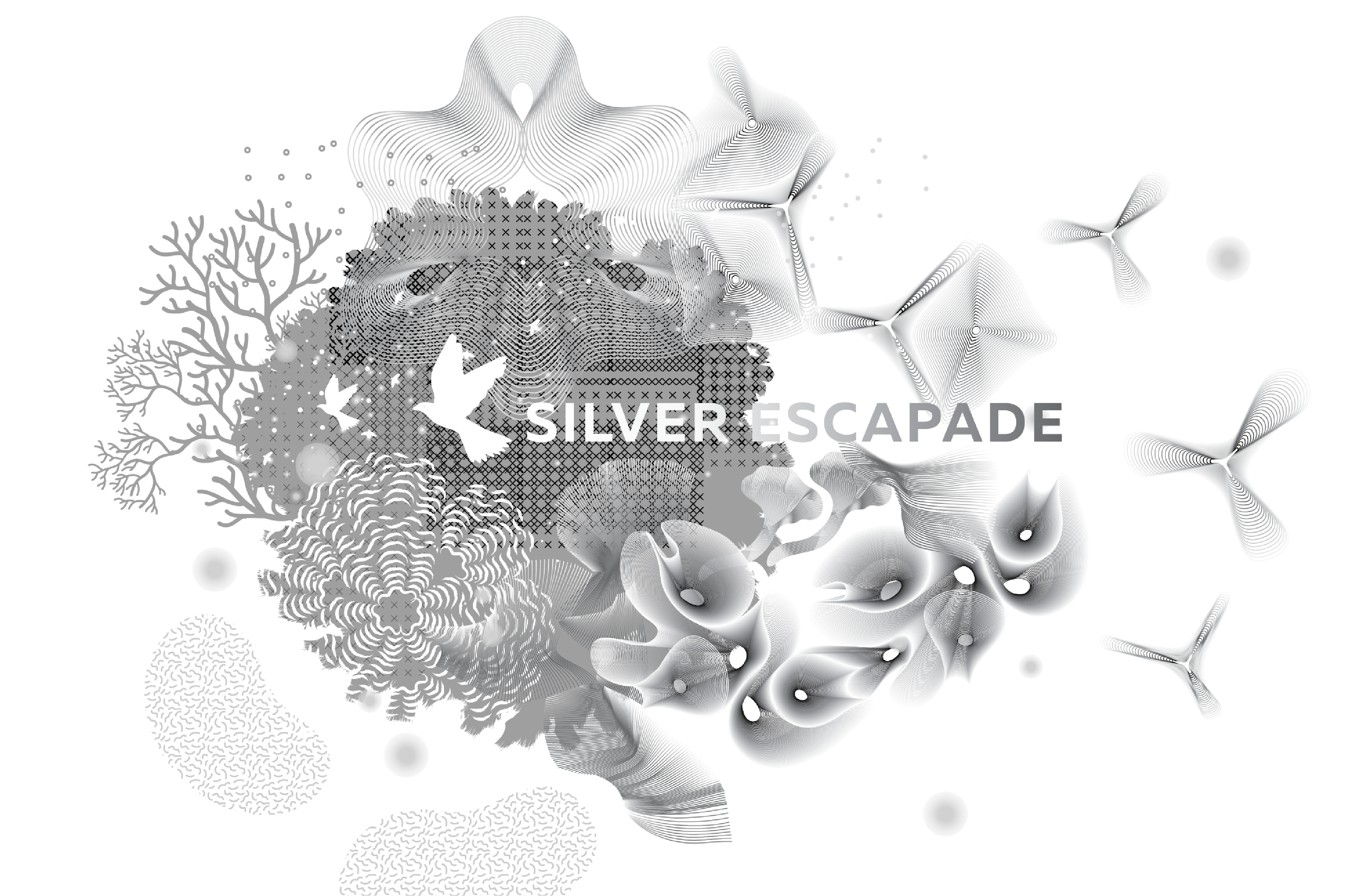
The final outcome is a modular system of illustrations and patterns that can be layered, scaled, and recomposed to create immersive environments.
Silver Escapade explores silver as expansive and dreamlike — it interprets silver as introspective and atmospheric — where tonal gradients, abstract marks, and layered transparencies build landscapes of imagination and possibility. Silver becomes less a surface and more an experience — dynamic, reflective, and evolving.
Outcome
The result is a flexible visual system that translates a single colour into a storytelling framework. The elements can be used in multiple permutations across formats, maintaining coherence while allowing variation.
Silver, in this context, moves beyond decoration. It becomes a narrative device — carrying memory, transition, and the quiet optimism of forward motion.