


From Earth to Expression: Translating Terra into a Visual Language
A visual language developed from Terra — an earth tone translated through texture, form, pattern, and illustration into an immersive system that extends across editorial covers and printed communication.
COLOUR STUDY
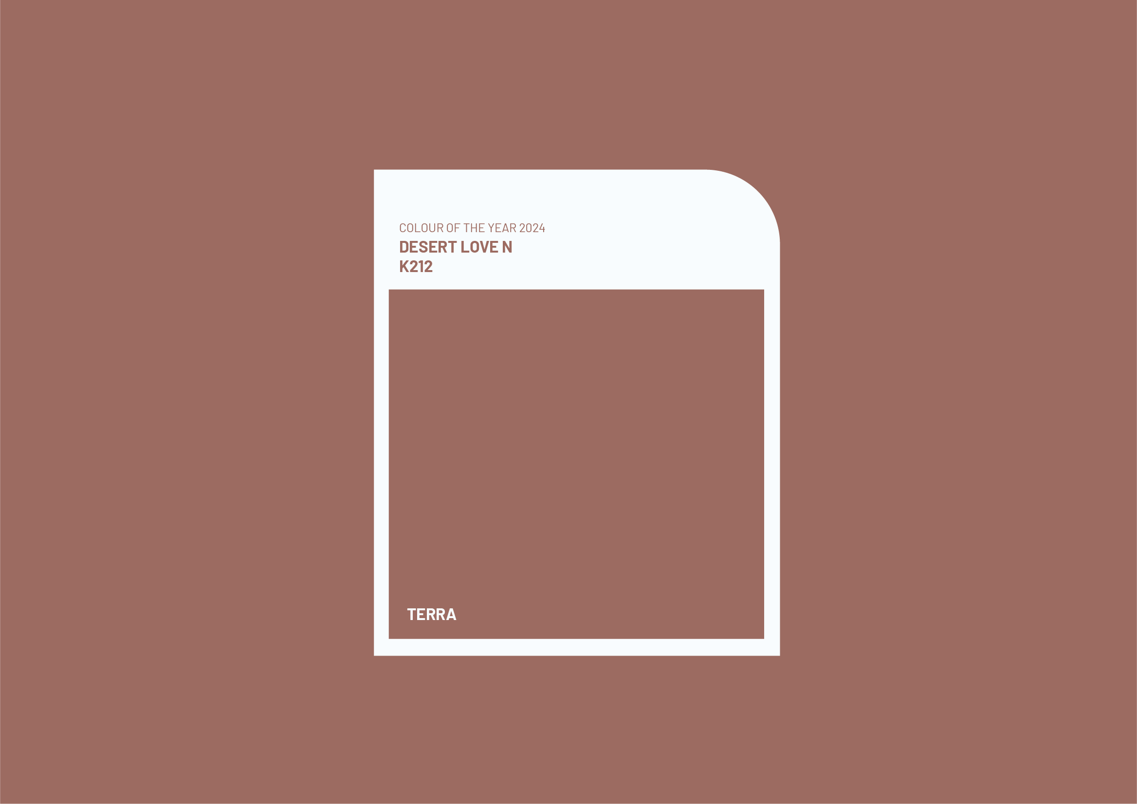
Terra — A Language of Belonging
A visual exploration of Terra — translating an earth-inspired hue into a visual language rooted in materiality, memory, and the human connection to the natural world.
A visual exploration of Terra — translating an earth-inspired hue into a visual language rooted in materiality, memory, and the human connection to the natural world.
Essence of the Colour
Grounded in Origin
Terra draws from the elemental qualities of earth — its warmth, tactility, and sense of permanence. The colour evokes the physical and emotional relationship between people and the ground beneath them, bringing together ideas of belonging, origin, repetition, and ritual.
Rather than treating colour as a purely decorative element, the exploration considers how it can become experiential through texture, form, and visual rhythm.
Terra draws from the elemental qualities of earth — its warmth, tactility, and sense of permanence. The colour evokes the physical and emotional relationship between people and the ground beneath them, bringing together ideas of belonging, origin, repetition, and ritual.
Rather than treating colour as a purely decorative element, the exploration considers how it can become experiential through texture, form, and visual rhythm.
Keywords
EMOTIONAL SPECTRUM
- Grounded
- Rooted
- Reflective
- Meditative
- Familiar
- Connected
- Nurturing
- Timeless
- Organic
PHYSICAL SPECTRUM
- Tactile
- Textured
- Layered
- Earthy
- Organic
- Warm
- Rhythmic
- Material
- Restrained




Concept
From Primordial Forms to Visual Language
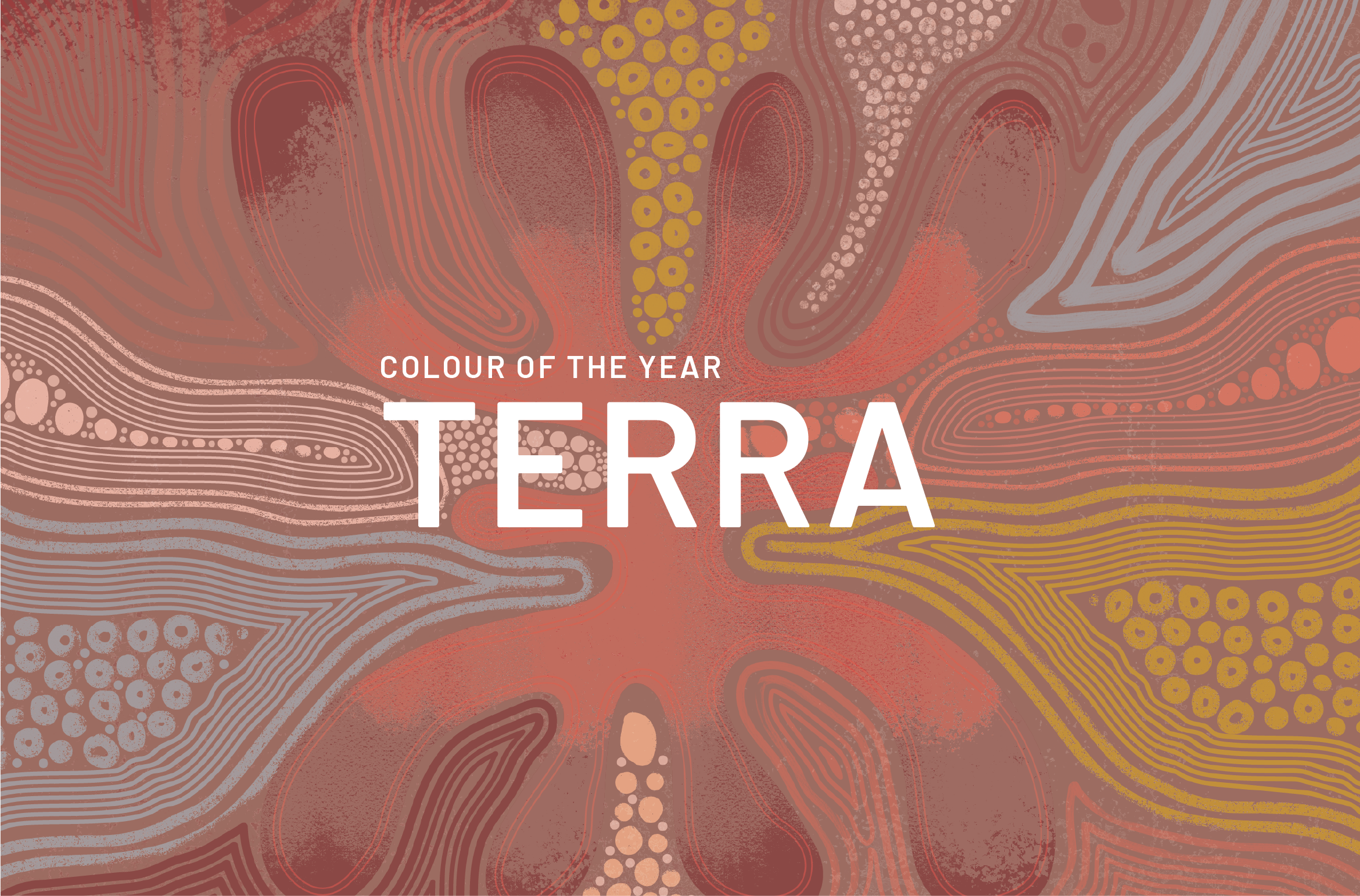
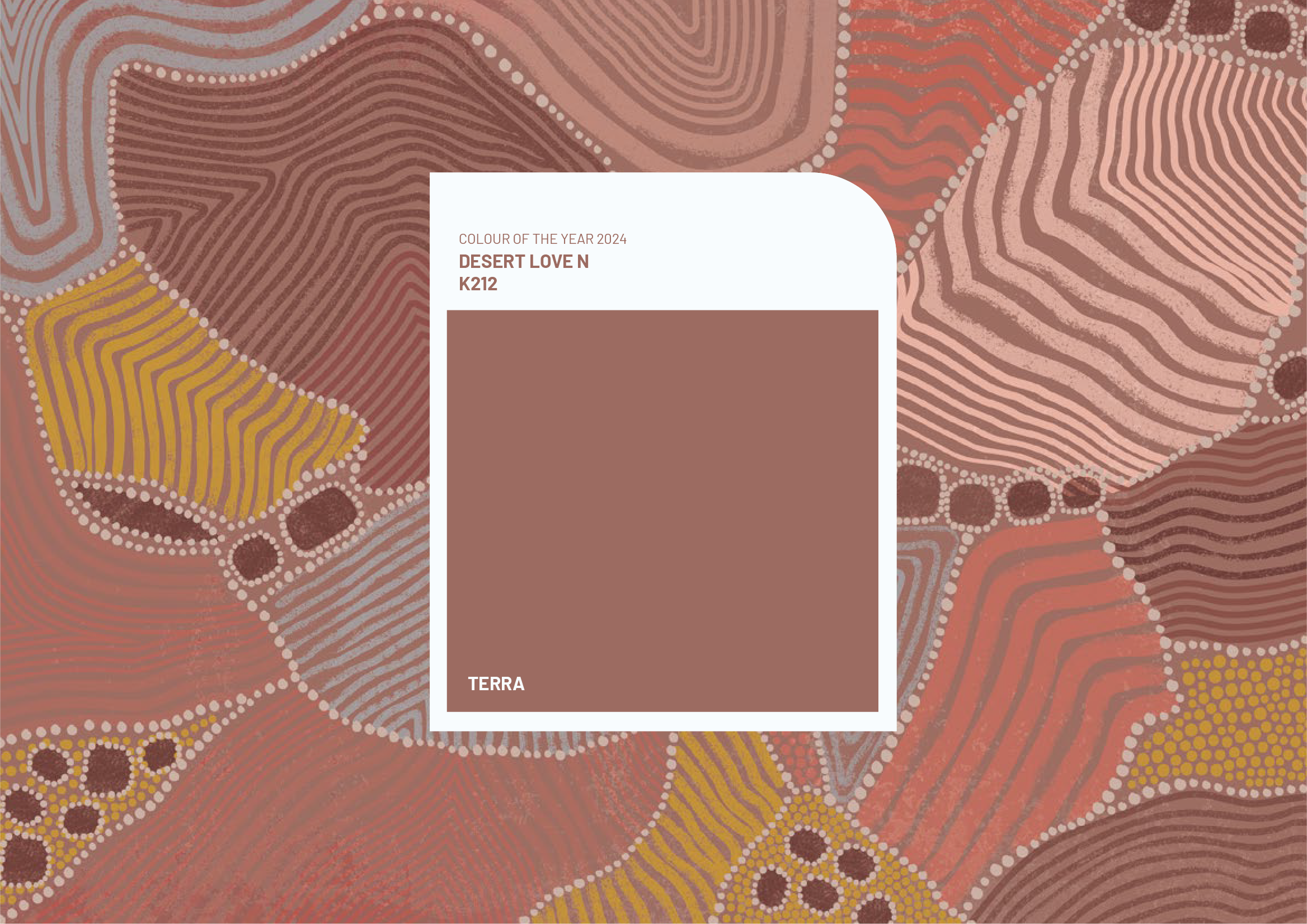
The concept explores Terra through bold, primordial abstraction inspired by early human mark-making and indigenous visual traditions. Forms reference trees, stones, seed pods, and cocoon-like structures — suggesting growth, shelter, continuity, and origin. Layered with rhythmic patterns drawn from cultivated landscapes, these forms become a symbolic vocabulary rooted in earth, memory, and belonging.
The concept explores Terra through bold, primordial abstraction inspired by early human mark-making and indigenous visual traditions. Forms reference trees, stones, seed pods, and cocoon-like structures — suggesting growth, shelter, continuity, and origin. Layered with rhythmic patterns drawn from cultivated landscapes, these forms become a symbolic vocabulary rooted in earth, memory, and belonging.
Visual Language
A Language of Form, Rhythm, and Return
The visual language brings together primordial forms and rhythmic patterns to create a grounded, symbolic expression of Terra. Simplified organic shapes evoke age and embodied knowledge, while repeated lines introduce order and stillness. Restrained tonal variations keep the forms expressive yet abstract, creating a cohesive system that reflects continuity, belonging, and the human connection to earth.
The visual language brings together primordial forms and rhythmic patterns to create a grounded, symbolic expression of Terra. Simplified organic shapes evoke age and embodied knowledge, while repeated lines introduce order and stillness. Restrained tonal variations keep the forms expressive yet abstract, creating a cohesive system that reflects continuity, belonging, and the human connection to earth.

SYSTEM APPLICATION
Extending the Language Across Formats
The Terra visual language was applied across multiple editorial formats and the event hanger, demonstrating the flexibility of the system. Illustrations, patterns, tonal variations, and graphic forms work together as a modular framework that adapts across scales while retaining its character. From editorial covers to printed collaterals, the system transforms Terra from a single colour into a cohesive visual experience shaped by texture, rhythm, and the relationship between humans and earth.
The Terra visual language was applied across multiple editorial formats and the event hanger, demonstrating the flexibility of the system. Illustrations, patterns, tonal variations, and graphic forms work together as a modular framework that adapts across scales while retaining its character. From editorial covers to printed collaterals, the system transforms Terra from a single colour into a cohesive visual experience shaped by texture, rhythm, and the relationship between humans and earth.
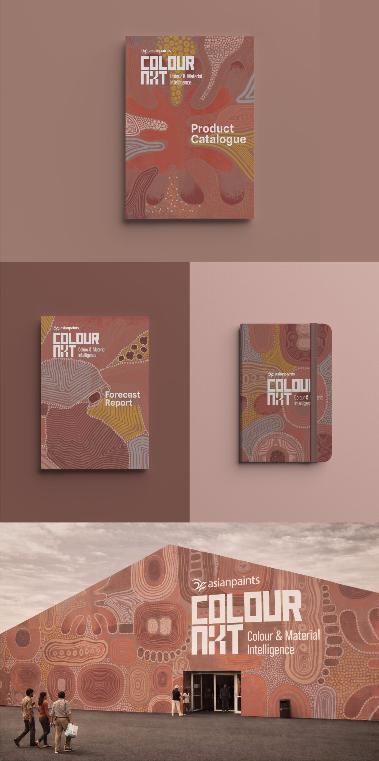
Illustration & Visual LanguageTrusha S
Collaboration STUDIO WARIWATAI
Client COLOURNEXT ASIANPAINTS